Adaptations can be a difficult to wrangle under the best of circumstances, attempting to reframe and reshape a complete work so that it can fit into another medium. Adapting a much-beloved and acclaimed story adds another layer of complexity, and adapting something that’s already been adapted is even more difficult. All this is to say that The Handmaid’s Tale: The Graphic Novel has a high bar to clear, thanks to the popularity of Margaret Atwood’s 1985 book as well as the more recent Hulu series.
Canadian artist Renée Nault is responsible for both the work it took to adapt TheHandmaid’s Tale into graphic novel format and the entirety of the art, a clear labor of love. The book is striking to look at inside and out, a testament to the impact that good cover design can have. The hardcover edition is a matte black with stark white and red lettering and the small red figure of protagonist Offred, and it sets the stage beautifully for the story inside.
To most, The Handmaid’s Tale is at least a little familiar now: the story of a not-too-distant future where women in what was once the United States are divided into classes, fertile women used as walking wombs. Between the original novel and the television series, more people than ever have at least a passing knowledge of the plot, and there won’t be too many surprises in this adaptation.
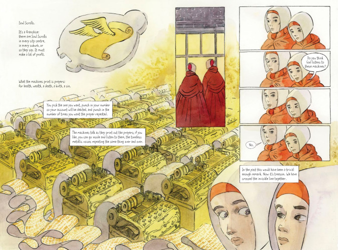
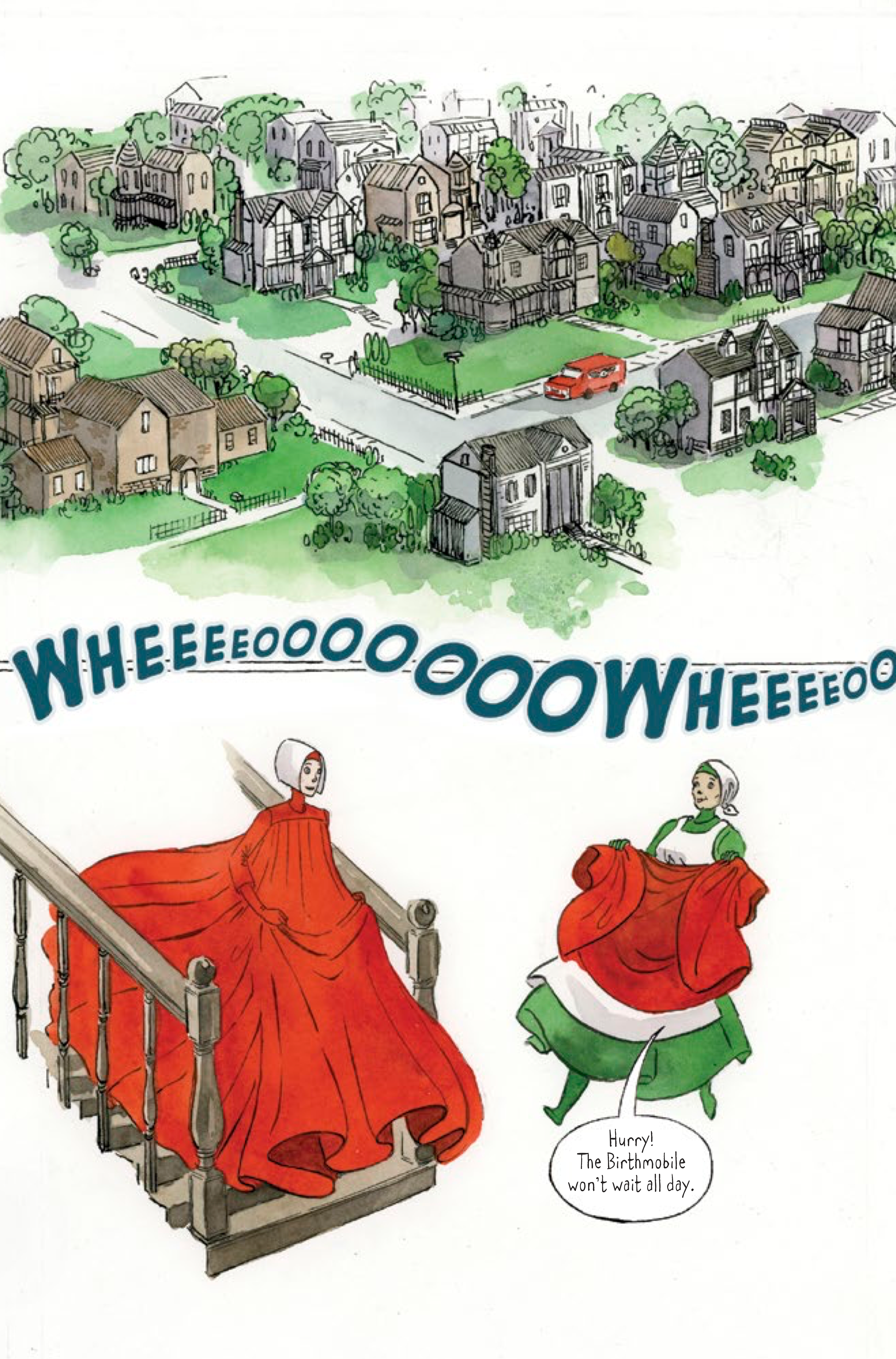
Nault has great skill when it comes to water colors, but her style is poorly matched to the subject matter. The way she depicts the Handmaids in particular often feels closer to a fashion spread than it does an oppressive and dystopian nightmare: Their red dresses are luminous and voluminous, draping gracefully and dramatically around their bodies. The blue dresses, hats, and veils of the Wives look refined and old-fashioned, and the same with the white worn by Econowife brides. Everything is too pretty and delicate and aesthetically pleasing to instill the sense of fear this story deserves, flattening the horror into almost romantic moments that don’t feel dangerous and robbing June of anything other than her fear and indifference.
It is possible to create art that is beautiful and unsettling and terrifying at the same time. Emily Carroll is proof of this, as is Beautiful Darkness by Fabien Vehlmann and Kerascoët. Watercolors can be used to evoke all sorts of powerful emotions, from Jill Thompson’s work on Beasts Of Burden to Dustin Nguyen’s incredible use of shape and white space on Descender. But Nault’s work looks too pleasant to be part of Gilead. June’s hair is long and moves around her beautifully even as she complains about using butter as lotion to repair her dry skin, the spartan room that she is caged in is rich with color and texture. Oddly, the only thing that is older and less beautiful in the graphic novel than in the TV adaptation is the Commander. The feeling is that even now, in telling her own story, June is being presented for consumption rather than understanding and warning. She’s drawn like the protagonist in a gothic romance, meeting Nick for a clandestine moment that seems to confuse desire for humanity.
It’s frequently difficult to tell June and Ofglen apart, let alone the second Ofglen from the first. Any graphic novel that relies so heavily on uniforms is going to have this challenge, but Nault stuck to the same slender and conventionally attractive white women throughout. And distressingly, almost every face in this book is white. The original novel and the TV show have both come under fire for their failure to adequately address the issue of race, and Nault could’ve learned from this valid criticism. Overall, the book feels self-indulgent and has an air of thoughtlessness. The implication is that age and lack of beauty are somehow moral failings as Serena Joy, Aunt Lydia, and the Commander are shown in great contrast to the Handmaids, Nick, and Luke, each of them beautiful and superior in their resistance. It’s a choice that misses the purpose of the book entirely and robs the tale of its heft, suffering the same failures as last year’s terrible Jane Eyre adaptation.