Usually, when comic books are discussed, the focus is on the muscular, super-powered folks who generally inhabit them. They’re the ones, after all, who get the merchandising deals and the movie contracts. But today, some overdue attention is finally paid to those convenient word balloons that have hovered over the heads of Batman, Spider-Man, and Flaming Carrot for so many decades. Where would comic-book stars be without those visible words? The characters would have to explain everything through pantomime, which could take forever. Better to have “Unhand her, Braniac!” just magically appear in a nice oval at the top of a panel. In the latest episode of Vox’s webseries Almanac, host and narrator Phil Edwards examines the history of comic book lettering, how it began and how it has developed. It’s more interesting than one might guess.
This eight-minute mini-documentary is titled “Where The ‘Comic Book’ Font Came From,” but Edwards spends much of the time explaining why the notion of a so-called standard comic book font is really a myth. The dreaded Comic Sans aside, there is no such thing. The distinct, hand-drawn, all-caps look people associate with comic book lettering developed out of technological and economic necessity, Edwards explains, but different artists developed styles all their own.
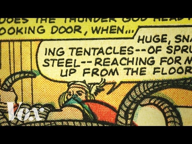
In their earliest days, before the advent of computers or the introduction of slick, glossy paper, comic books were churned out quickly and cheaply in an assembly line fashion. The tedious task of lettering likely went to the staffer with the neatest handwriting. The practice of writing the dialogue in capital letters stemmed from the fact that comics were printed on cheap paper; editors wanted the words to be easy to read under even the worst of circumstances, including blurry ink. Edwards compares word balloons to some vintage comic book advertisements and demonstrates how the latter were often illegible thanks to lousy printing. In later years, the lettering process was computerized, but the typefaces were generally based on the hand-drawn style of vintage Marvel comics from the 1960s. And no two are alike. Each has its own little quirks and trademarks. One artist’s R is not the same as another artist’s R, Edwards explains.