In entertainment, an awful lot of stuff happens behind closed doors, from canceling TV shows to organizing music festival lineups. While the public sees the end product on TVs, movie screens, paper, or radio dials, they don’t see what it took to get there. In Expert Witness, The A.V. Club talks to industry insiders about the actual business of entertainment in hopes of shedding some light on how the pop-culture sausage gets made.
In a little over five years, colorist Jordie Bellaire has emerged as one of the most prolific creators in the comic industry. She won a 2014 Eisner Award for her work on 11 different titles, and she’s maintained this heavy workload as her profile steadily rises. Bellaire is nominated for another Eisner this year, once again for her work on 11 books, and readers of these series know exactly why she’s earned so much recognition. Bellaire makes strong, confident choices that are driven by her personal relationship with colors, and the emotional foundation of her work makes it especially engaging. She spoke with the The A.V. Club to break down her process on five pages from different series, exploring her evolution as an artist, the significant inspiration she gets from films, and how coloring plays an integral part in maximizing the impact of a story.
Journey Into Mystery #648, written by Kathryn Immonen, art by Valerio Schiti
The A.V. Club: This is an earlier page in your professional coloring experience. What compelled you to pursue coloring as a career?
Jordie Bellaire: Well, I went to art school, and I majored in illustration, and I had a lot of interest in working in comics at the very beginning, but I didn’t feel like I had it to be an illustrator in comics. So I ended up relying on illustration gigs. Eventually, I really wanted to break into film or maybe children’s books. At my school, they taught me with an illustration degree, you can do anything. We had people from the CIA visit our school to recruit, and car companies—the weirdest stuff. It was kind of ambiguous as a major, which is amazing, because you really can do anything.
I met Declan [Shalvey, a comics artist] in New York City not even two months out of school. Him and I were talking, and he was asking me what I wanted to do with my life, and I just said, “I just want to be happy.” He said, “You’re aimless.” I was like, “Fuck you.” He was all like, “You really like comics. You should try to work in comics.” So he encouraged me to keep drawing. It was hard when you start dating this magnificent titan of talent like Declan who can draw a horse when you say, “Draw a horse.” It took me a long time to draw a horse. So, I started thinking, “I just don’t have it in me to draw fast.” He doesn’t like to hear it, but I think that kind of waned on my dreams of being an artist-artist. I don’t blame him for it. Again, he sometimes takes insult to that. It’s just, you know, I started realizing maybe I really don’t have what it takes.
One day, he was talking about getting colors for something. I was like, “What do you mean getting colors for something? Don’t you…?” Because I had also gone to school where I colored my own stuff. He was like, “No, no. There are colorists and letterers.” It’s weird for someone who’s been such a big fan of comics all my life—I never put together that those were different jobs. It was really bizarre. It’s one of those weird moments where I was really ignorant. I was like, “I can do that.” He was all, “I guess you can try, but you’re not going to get the gig, but you can apply for it anyway.” So, I applied for it but didn’t get the job. He was like, “Don’t let that stop you, though. Go in.” So, I kept trying mostly to also make rent. I was really, really, really broke in New York City. My illustration gigs weren’t going too well.
It’s really hard to make it as a freelance illustrator in New York City sometimes, especially when you’re right out of college. So I started coloring practice things to see if I could get jobs, and then who’d hire me. Stephen Mooney hired me on an IDW short that he was doing for Angel: Yearbook, which was the last big thing that came out there. After that, it was awesome. A lot of these artists that knew me from college—Chris Samnee, Tom Fowler, Ramón Pérez, and Declan—they knew me from my art-art, and when they started seeing I was coloring comics they were like, “You’re coloring comics? That’s weird. Why aren’t you drawing anymore?” I was like, “Well, you know. Whatever.” They were like, “Well, if you’re coloring, why don’t you color my stuff?” I was like, “Sure. I’ll color your stuff.” It kind of took off from there.
I was very lucky in that way. Right at the beginning of Twitter, as Blogger was dissolving—it’s not dissolved, but you know what I mean—I was right in there. I just put out my work, my illustration work, my coloring work. I just kept getting more jobs. I decided this pays the bills, and so I kept doing it with a side of drawing. But again, the more people I met, and the more I saw Declan drawing, the more and more I realized maybe drawing is not for me. The more I actively pursue coloring, the more people were responding to that so positively. I felt like I had kind of found what what right for me, what made people happy, what made me happy, and what made me happy and kept me paid. So, I went with that. It’s been a full-time career now for me for about five years. I’ve been doing it since about 2011.
I never really looked back, to be honest. I’m pretty happy. I can’t draw for shit now, though. It’s pretty depressing. Every now and again, I’ll be visiting my parents and because I went to a very expensive private art university, every now and again, I’ll be silly with my parents, and I’m a little drunk, and I’ll be drawing goofy drawings, and they’ll pick it up on the napkin and be like, “You spent so-and-so dollars in debt for this? What happened?” I’m like, “Hey, man. I’m an Eisner Award winning colorist! I don’t need your napkin doodles. I’m fine. I’m down for this.” I do miss drawing, but coloring is very fulfilling.
AVC: How did you score the Journey Into Mystery job?
JB: That was one of my very first gigs at Marvel. I was really happy to work with Kathryn [Immonen]. Lauren Sankovitch hired me on there. She’s also working with editorial things on Kelly Sue [DeConnick]’s books now. But Lauren is really cool. I met her in New York City, and she hired me on Journey on a whim. I was really, really excited. I think I had already done John Carter, and my Doctor Strange and Hulk origin stories. Journey was kind of my first—John Carter was good, but it was kind of on the kid side of things.
I got hired on Journey, and I just went for it. Kathryn was really open. She didn’t say things like, “I need orange light” or anything. I just got Valerio [Schiti]’s inks, and I was like, “I’m just going to do my best John Carter/space impression of this.” I went kind of mental, but I have to say the response was really cool. I didn’t expect people to like the blue-blooded guy, too. When I colored it, I honestly was in such a rush that issue. I was not rested, and that blue blood felt like a great idea at the time with those orange backgrounds. And then after I was done, I was like, “People are going to fucking hate this.” People are going to be like, “Why is this character blue-blooded?” I just felt really stupid. After that, I sort of made it a rule to not have characters have normal-colored blood. I love pink blood, purple blood—I think it’s fun. I just think it looks… it’s something unexpected for the reader. I played a lot with that in Manhattan Projects back in the day, too, using weird blood colors. I just think it’s fun.
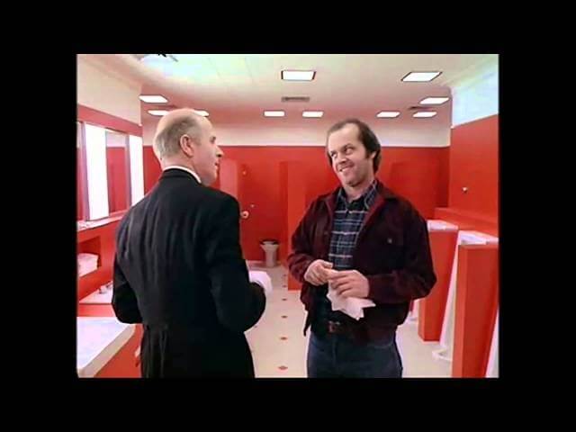
AVC: It’s interesting that you bring up The Manhattan Projects,because one of my questions is about this page and how it relates to Manhattan Projects—specifically in the really strong red and blue contrasts, which was very pronounced in Manhattan Projects as well. It’s something that you come back to a lot. What do you find really effective about that color combination?
JB: Well, I think it’s really loud. It’s nearly complementary colors, but not. John [Hickman, Manhattan Projects writer] was sort of the driving force of the red and blue—he wanted that whole division of red and blue because of the Oppenheimer thing that he was doing, but Cris Peter had colored the first issue, and she had done red and blue. It’s very interesting that you can tell colorists red and blue, but sometimes it’s really up to the artist’s interpretation of what is really a red-red and what’s a blue-blue. Do you know what I mean? So, Cris kind of colored hers like a blue spectrum, while I went way more pure blue saturations. I’m way more attracted to not just like murky blues or greenish-blues. If somebody asks me to do a red/blue scheme, I go full Kubrick with it. I think that’s where that comes from, Kubrickian-type saturations of colors like [The Shining’s] red bathroom sequence.
I actually called that out in Moon Knight #4, which I just finished coloring. Me and Greg Smallwood are really big Kubrick fans. There’s this scene in the bathroom in the new issue. I just went for it with red bathroom stuff. I love that kind of Kubrickian thing. I talk a lot about being inspired by movies. When I think to red and blue, I’m normally thinking from a film standpoint. Have you ever seen Hard Candy with Ellen Page by David Slade?
AVC: Yup.
JB: I love those reds and those yellows. Again, I think if another colorist does that kind of stuff, you think about it in relation to comics or even a filmmaker, they can use a darker red wall, or like an oxblood red wall. But there are some people who just say “Red wall? Cool, you got this.” And they just go, “Here. Active red.” I just like those bright colors. I think they get a more instantaneous reaction if used well and used sparingly. So, in Manhattan Projects, it was a narrative device suggested by John very specifically for his own meanings of things that I still never got to know the whole story on, because John kind of was a wizard. He was writing on the page and thinking on the page, so we just kind of went by with his driving force.
He was the conductor to this song that, on other things, like Journey Into Mystery, I felt very much a part of the project. On the other books, if I ever used those bright, saturated colors, it’s normally because I’m making my own personal narrative decision and trying to carry that kind of signal throughout the book. Like Moon Knight #3 just came out, and somebody was asking me in the first two issues of Moon Knight, “There’s a lot of red in there, is it for any particular reason? Like, I notice that it kind of comes up again.” I’m like, “Yeah, it’s a narrative color.” I like that kind of spot color treatment in film and in comics. I think I’m trying my best to rip off good movies and put it in comics.
AVC: When you get an action-heavy page like this, how are you using color as a way to accentuate the force and the speed of what the artist has put on the page?
JB: That’s a very good question. You hope that it looks like you’re doing a good job. You hope that you’re driving a page and leading the reader’s eye around. That’s a very important lesson as a colorist that you learn mostly to try to really push the reader through. It’s interesting, because Valerio does a lot of that already with the way he’s using the blood spray. But with certain contrasts, like pushing the background back, and then, through blood, basically bringing you through from panel to panel, and then maybe putting blue in the background or something of another panel, you’re really flowing through the violence of the scene by using these key colors, these narrative colors that are very, very instrumental in demonstrating violence without always even showing violence. If you knew that character had blue blood, for instance, on that page, and you see all the hacking and slashing, and if the next page, you flipped, and it was an all-blue page, you would very clearly understand that was a massacre. I like that element of pushing forward color, but I think a lot of that comes down to the artist. It’s just about the pacing of the story, as well, which comes down to the writer and artist.
A colorist is really just there to make sure the reader follows that, make sure you really push through the scene and go through panel to panel and see the stacking of the violence or the tension. You can work out the obvious colors. It’s not even always obvious. Some people can build tension by sucking color out, or something. It’s just up to making sure you work as well with the art as you can, and with the story, to build up the right amount of emotions that people should be feeling. I’m not trying to give myself any credit, because I really do think a lot of it falls on the artist. You just have to be a very thoughtful colorist. You just can’t go in there and throw gravy in and make it brown, because otherwise, you will get lost. You know what I mean? That won’t work in service of the artist. So, I just do my best to work in service of the artist, which is just trying to use loud and effective, communicative color that will show the reader exactly where they’re supposed to look and hopefully what they feel they should be getting emotion from.
Flash Gordon #5, written by Jeff Parker, art by Evan “Doc” Shaner
AVC: While on the topic of emotion and feeling, let’s jump into Flash Gordon.
JB: I love Flash Gordon. I miss it, but now we have Future Quest, so it’s all good.
AVC: They’re so similar in the best way. This page is completely different from Journey Into Mystery. The other one is all action, and this one is all atmosphere, and you have dialogue, whereas we didn’t really have any in the last page. How do you use color to ease a reader into a setting?
JB: Oh, interesting.
AVC: Especially this spread, it feels very open, very warm, very welcoming. What are the choices you make to create that mood?
JB: It’s a lot about psychology of color. Sometimes a blue or pink can be used for the opposites of what they’re known for, which is like beauty and loveliness. I’m really excited about that Neon Demon film by Nicolas Winding Refn. That movie looks like it’s using a lot of pinks, but they’re going to be used for evil, while you can use pinks in Flash Gordon and have it be bright and summery, like Sleeping Beauty. So, I’m just working with psychology of color there.
Openness and light blue skies feel warm, and inviting, and pretty, and all those beautiful clouds that Evan drew just draw you in. They feel so full you could jump on them and eat them like cotton candy, like in Aladdin. I think about Disney movies a lot, too. Their psychology of color makes you feel like, when you’re a kid and you watch those movies, you feel really sucked into those universes. I emulate a lot of that, especially when I color high-contrast books like Evan either on Flash Gordon or Shazam or Future Quest. I think it’s me doing my best Disney impression, because Disney can bring you to really, really light, lovely, beautiful places with nice soft colors and bright contrasts. Everything feels dreamy and lovely.
Then, they can take you to really dark, dark places like All Dogs Go To Heaven, which was not Disney, but that movie is amazing. Completely dark and unreal and really disturbing. To a kid, I think that tattoos to your eyelids forever. It certainly stayed on my brain for a lifetime. That’s kind of all I think about when I color stuff like that. Especially a scene like that, I just try to think about being a kid again. Is that weird? When I color a scene like that, I just think, “What would Disney do?” Again, it all comes back to ripping off film as best I can from memory. But it’s weird, because I don’t really reference films so much. I just think about the movies and think about the emotions that I felt.
AVC: In this spread, we’re starting to see some more attention on textures in the rendering. The rocks and the clouds have a graininess. When did you start focusing more on that aspect of the coloring process?
JB: That’s another very good question. I was working with texture for a while, like in Manhattan Projects and stuff. I created a lot of my own brushes and things. I feel like I was always doing it because I always really loved Dave Stewart’s textures, and I really wanted to be that way. I think I’ve gotten better over the years. At a time I was nervous about using them, because I didn’t want people to be like, “Oh, she’s just trying to be like Dave Stewart.” But I think, at a certain point, you realize even if you have the same tools as somebody else, or if you have the same thought process as somebody else, your work is not going to look the same, unless you’re intentionally ripping them off, and I don’t study Dave Stewart every night. I don’t even read comics anymore. I’m too busy. I’m one of those. So, I started realizing, “Fuck it. I’m just going to do what I want and use textures where I want. Damn the man if somebody says it looks like Dave.” But I’ve never been accused of that, and I’m happy about that.
What do they say? “Good artists borrow, great artists steal.” Great art is about stealing what someone else has done and making it your own. All I’ve done is take an idea that I’ve seen Dave use extremely well, which is putting texture in everything from teacups to mountains to whatever and just really trying to rock that myself. I think giving texture to everything just gives it—I’m sorry, I’m going to mention another film, another filmmaker—it gives it such a Cronenberg feel. I love when you watch a Cronenberg film, everything has texture to it. Everything in life has texture, but the way that Cronenberg shoots things and lights things, even just the way the stories are made. There’s something so gritty and grainy about every single thing, and I love that idea of pages—I don’t really like to just throw a gradient on something and push it back. Even if I do it on the sky, and it looks really beautiful, part of me is like, “I’ve got to put some texture in this.” Painting in textures just makes it feel like a painting. It has a sense of life to it. It can really lighten up a page, which is very funny with Cronenberg. Of course Cronenberg is all about things coming to life and really creepy, little pink arms and stuff. So, go figure, it’s like the same thing. I’m not totally crazy for comparing the life of a page to Cronenberg.
Texture and attention to little details like a crack on a glass, where light would fall on one side of that cracked glass. It gives it texture, but it also gives it an identity and really places it. People don’t notice it, I have to say. It’s so nice that you notice that stuff, but some people will look at that glass, and acknowledge that glass, and move on, but other people will look at it and be like, “Why does that glass look so believable? Why is that glass so extra special?” It’s because, you know, you gave it just a little bit of definition, a little bit of texture, a little bit of love. That’s all.
AVC: I know to spend more time on your coloring, because it’s going to be more specific. There’s going to be a choice there. There are plenty of colorists where I’m not lingering over every panel, because they just put a really aggressive gradient on it.
JB: I’m not into grads. I feel bad. I think there are times and places for grads. I’m teaching some students right now, and I was just having a big conversation with them yesterday to not just throw style over style to cover up bad color choices, or make it look like a good color choice with zero technical skill. And also, don’t just throw grads on everything because you don’t know how to reinforce your idea of color. It’s hard. Good things are hard to work for. They’re not always easy. So, to make something look extra life-like—not even life-like—don’t get me wrong, it’s not about technicality. You can makes something look visceral and real without making it look super over-rendered. It’s just about capturing that emotional balance with the right amount of texture.
They’re Not Like Us #9, written by Eric Stephenson, art by Simon Gane
AVC: Especially on They’re Not Like Us,the way you’ve chosen to style the coloring and do all those sharp angles and overlapping planes is just really, really interesting. Why did you decide on that approach for the series?
JB: Okay, you’re going to laugh, but I’m going to mention another movie again. Toward the end of school, they were like, “Jordie, maybe you should be in a film school.” I was like, “You waited four years to tell me that? Thanks.” I would have gone to film school, but I thought I would make it as an artist. So, I thought about film a lot in They’re Not Like Us, because I love 101 Dalmatians. It is like the best movie ever. So beautiful—if you’ve never seen 101, it’s gorgeous.
AVC: Oh, I’ve seen it. Many times. My bedroom as a kid was 101 Dalmations themed. I had a car bed with a 101 Dalmations bedspread.
JB: I love that stuff. It’s just such a beautiful move. So cute. I love every color. My ridiculous love of dogs comes from—you want to save all the puppies. Cruella De Vil is also one of the best villains ever next to Jafar. But anyway, yes, I love 101. So, when I was coloring that, I haven’t really seen Simon Gane’s work colored before, besides the excellent Dave McCaig on Northlanders. So, of course, I always get really scared when I know Dave McCaig or Matt Wilson or Betty [Breitweiser] has colored someone before me. I’m like, “Ugh, I shouldn’t do this. They should just give the book to them.” But I was like, “Eh, I like Si’s work. I’m not going to do—or try to even do—what Dave did. I’m going to finally make this my 101 book.”
I looked at a lot of 101 artwork before I started thinking about how I was going to color it. I knew I wanted to keep it choppy and painty and make it look like there was tape on the page, and then used for color textures, and then ripping the tape off and keeping that straight edge. Cool stuff like that. The more I looked at the 101 art, I was trying to find a balance, and then I did the thing where I put the 101 art away. I don’t look at it again, and then I color again from those memories I have as a kid and from what I saw via my reference of really great background art and stuff. That’s basically all I did with They’re Not Like Us. It’s just my best 101 Dalmatians impression, trying really hard to capture that sort of lived-in space, but also just feeling all the color and the shifts of color and how choppy and disconcerting everything is as well, because it’s a very weird story. You never really know what’s going on, which I love about it.
I love working with Eric [Stephenson, writer of They’re Not Like Us]. Simon was also really accepting of it. It’s a book where I think I have the most fun, and I get no notes. It’s so weird, especially that party scene where they’re in a bar. I really expected Si to be like, “Those are really distracting.” But Si was like, “Love it!” I was so happy. They let me do exactly what I want creatively.
AVC: And with this page, I want to talk about using color to create ambient energy. You mentioned Matt and those party scenes in The Wicked + The Divine, which do a really similar thing. How you use color to create that party atmosphere?
JB: That’s just about thinking about those fun party colors of strobe lights and things. A long time ago, Matt actually did a Wonder Woman page, which I thought was pretty cool, of Wonder Woman at some sort of party scene back when he was doing the Cliff Chiang Wonder Woman stuff, and he had this great thing where he showed the way he deconstructed the page from background, interior, and stage. And he talked about the way he separated those colors. I can’t remember if, in that story, he flashed the colors. I don’t know if he changed—maybe he rotated it? Even with Zero, there’s this scene where this elevator door opens up and then closes, and we have this fight going on. I can’t remember exactly, but I just like playing with light like that. It’s so hard, obviously, because it’s not a medium that’s in motion, but if you can capture motion with weird strips of color and flashing lights, like Matt does in The Wicked + The Divine, Matt somehow captures light flashes without having a light.
It’s almost like it’s alien. When you color scenes like that, you make them look as alien as possible and unusual to the reader while also making them look really just warm, neon, and hip. I don’t know how else to explain it, because I don’t even go to clubs, to be honest. I don’t like clubs. I’m not a clubber. I don’t like parties or anything, but I love, I don’t know, again, Disney movies, like The Emperor’s New Groove. Those bright purples and yellows. Just feeling the jam. Feeling the magic. I’ve been to rock concerts, and rock concerts have, you know—everyone is kind of bathed in a blue light, and then you normally have your band in a pink light, and the way that pink light flashes.
I saw Sleater-Kinney live last year. They had an amazing fucking backdrop that clearly an artist kicked the shit out of. The way those colors reflect, in a way, they’re so unusual and alien, but beautiful. I think that that’s all I hope to do in those kinds of party sequences. I’m sure that’s all Matt tries to do while also creating that balance of depth, you know, because you do have to place the bar in front and place the partiers out in the surrounding area. Stuff like that. It’s fun working with depth with those fun colors, but then you still get to throw in these really wacky, unbalanced, completely bizarre colors just to tie the whole thing together.
AVC: This is the only page I picked that has prominent yellow on it, and I’m really intrigued by the glass color in this one, how they all have this glowing yellow that makes them form a trail that guides the reader through the page. Was that an intentional choice?
JB: A lot of that is intentional sometimes, but I think, again, it’s kind of like instinct-intentional, if that makes any sense. It’s one of those things that you start doing, and then you’re like, “You have to do it.” You make yourself your own little weird mental rulebook, and then by the time somebody points it out, you’re like, “Oh yeah. Yeah. Of course that’s on purpose,” but you don’t think about it while you do it. I knew I needed something there, and I’m really—I did go to Halloween Horror Nights once, and they have these really bright glasses, like these black-light-type of glasses. I like that kind of weird idea of the black light glass or the neon shots or whatever. Stuff that glows. So, having that glass be bright and also guiding the eye through the piece, it ties you to the bar away from the background. It brings you right to the foreground. Stuff like balance and things like that, fortunately, come to me instinctually. I think the balance just falls into place, because I’m more thinking about, “How do I evoke this really cool Halloween Horror Nights black light mug I saw,” rather than, “This is going to really force the perception of the balance.”
You’re noticing the balance in the way it’s taking people through the page, but I’m just like, “It’s a cool color.” The balance isn’t important. It’s about how cool this color is. But I appreciate you noticing it. There’s this really awesome scene in Zodiac where Robert Downey Jr. is out at this pub with Jake Gyllenhaal, and he orders a Blue Lagoon, and Robert Downey Jr. looks at him like, “Really? A Blue Lagoon?” He’s like, “Don’t knock it till you try it.” And then the next scene is them with like 18 Blue Lagoons on the table, and the Blue Lagoons are in the same type of really tall cocktail glass, these really elegant kind of ’50s ones that kind of flute at the top. And it’s got this really bright aqua-blue liquid in it with a red cherry and a yellow pineapple. So, I was totally thinking of that scene when I colored that page. I was like, “These are going to be my Blue Lagoons.” It’s that kind of stuff, Oliver. You’re really realizing what a super nerd I am.
AVC: You’re talking to The A.V. Club. You can nerd out about as many films as you want.
Pretty Deadly #8, written by Kelly Sue DeConnick, art by Emma Ríos
AVC: Pretty Deadly is the most experimental book you have in terms of an artist’s layouts.
JB: Oh, yeah.
AVC: Has that inspired you to think outside the box when you’re coloring it?
JB: Emma [Ríos] always helps me think outside the box, and how beautiful, and elegant, and just so Argento her pages are. They are the Argento-est of paper pages. They’re so weird and bizarre. We talk about it in group emails. They’re open to all my really weird explanations and ideas for strange color uses. We’re constantly trying to play up these really weird, organic, ghostly things Emma is doing, because—not just from a layout point of view, but especially in this newest arc, she’s working a lot with the smoke horse of Fear and War, the gigantic dude. I thought a lot about Bram Stoker’sDracula, with the red mist and everything. Again, they’re all open to those ideas, because I just think that what’s she’s doing is so palpable, but also so intangible.
It’s just really weird, so it’s cool making color hopefully work in service of that and push people around the page, because I do make the joke sometimes that I don’t even know what’s going on in Emma’s pages. Sometimes, I have to get on to Emma, like, “Emma, I can’t tell what is horse and what is ground, or what is human and what is mountains.” And I think it’s beautiful. She has tractor beam art that when she draws it, it draws you right in, and you just get lost looking at the pretty ornateness of it. In terms of coloring it, it can be quite difficult, but I really, really like the challenge, especially because she is so understanding and very sweet, especially if I have an issue of understanding what something is. She’s always very quick to give me a guide. She’s always like, “I’m really sorry! I should draw more clearly.” I’m like, “Fuck no! You keep trying weird and awesome. It’s beautiful in black and white. I just have to make sure I make you look as good as possible instead of making people confused.”
I like that challenge of it. We just get to go really apeshit with colors in Pretty Deadly, and they have never begrudged me for doing weird things with color. They’re always so open to the weird stuff I want to do. I think it’s an experimental book from top to bottom to be honest, because even Clayton [Cowles, letterer] gets to do really weird things, too. I think we all feel like all of our input is really fairly appreciated, even though Kelly [Sue DeConnick] and Emma own the book, they’re really, really interested in hearing my and Clayon’s thoughts and ideas about certain things. Clayton is really open to me with color about lettering. The first arc, I suggested that Molly the crow have pink lettering and black boxes or whatever. Clayton was really cool. I think he had already finished that page, but he did it.
Then again, they were doing a war in this newest arc, he has those red balloons or whatever. Clayton again just got onto me like, “How do you feel about these?” It touches you. Me and Clayton, obviously, are very good friends for anybody who knows us on Twitter. We’re very close friends, but even the letterer is asking me about stuff, and I’ll ask him what he thinks about in terms of lettering to do what he thinks looks best. We’re just a very open community of creatives all trying to make it look as different and unusual and uninviting but inviting at the same time. I love that book. It’s such a challenge, but I think it always comes out really, really great. I think we’re always really proud of the end result.
AVC: In terms of this spread, what are some of the specific coloring choices that you made to bring clarity to Emma’s art?
JB: I normally try to separate everything as fast as I can in terms of color and that’s also why I think I work with large fields of color with her, and then I kind of break it apart with soft grads and airbrush techniques and splatters. So, in this particular arc, there’s Germans who have the poisonous gas. That was obviously green, like a scummy green. And plus, we have this beautiful night sky that they’re fighting in, and then you’ve got these pinks in the background, because it’s like the red from War is infecting the sky. And then you have War, and he’s like this crazy mass, but I liked the idea of him kind of being pinky as well, because I’m always trying to get my Argento vibe in there. Actually, just looking at this thing deconstructed, purple, green, and pink-red is totally an Argento palette. I only need aqua in there, and it would be totally Argento.
I’m all about trying to separate all the planes as best I can, but then keeping them smoky and kind of untraceable. It’s weird. There’s a certain level of—I want the reader to understand what is happening and flow through, but I also want the reader to be swept up in the mist quality of this arc. Especially with War and Fear, the two smoky noncorporeal things. I think that’s important that you should be able to see them, but maybe not fully grasp them. So, I play a lot with color holds, which is when you make black line art a different color. In the two arcs we’ve done, normally all the characters are always still black line art, so they stay grounded in a reality while anything else that’s not of reality is normally pushed aside and made to be looking more smoky or more misty.
It’s easy to go from green to red. Those are also great complementary colors. The biggest thing that I do on Pretty Deadly that helps with readability is giving very clear narrative structure colors. Like, green is bad. Red is bad. Blue is dead. Things like that. And also, red of course goes back to Death in the first arc because of the red roses. You know, really little things like that. In the old story, when they’re telling the stories about Ginny, those flashbacks are kind of yellow. Ginny’s eyes got kind of yellow. It’s about always communicating these narrative ideas with colors, so at the very least, if somebody opens up a page in Emma’s art, and if they’re an asshole, and they totally just give up, and they’re like, “I can’t read it,” at least they can feel the things that they see in color, especially with how she draws things that I’m filling with color, so the more red it is, obviously, that looks bad.
It’s really about using communicative, narrative color in a very clear way, and not breaking my own rules, which can be a little hard. By arc three, who knows where my color choices are going to go. I hope that I’ll always be able to call back to sorts of things. I get pretty obsessed with narrative things like this. Me and Emma have had one or two conversations—like for instance, in the garden of the second arc, she has Sissy and she has her little bird vulture helmet thing, and Emma really wanted her to have a red tip on the end of it the way a vulture’s skull kind of looks. I really fought against that. I felt really bad, but I was like, “I just don’t think red should be in this sequence. I think if there’s going to be red, it should just be red roses.” It wasn’t like a fight, but I think she understood when I told her as a narrative standpoint, it’s just going to confuse the reader of what I’m trying to do.
So, if you remove the line art, having red there—it’s really small, and it sounds incidental and stupid, but that’s how obsessed I am with narrative color use in Pretty Deadly. I won’t even use red in a scene where I don’t think it should be there at all. I’ll fight it tooth and nail, even if people are like, “There really needs to be a red dress.” I’m like, “No. We’ll make it pink, we’ll make it purple, but it’s not going to be red, because it should not be red, because is already associated with A,B, and C. But again, don’t get me wrong: Pretty Deadly does not fight me at all. They’re really, really cool about stuff. But I think that’s the best way I try to do my job for the reader. Just, you know, clear and evident color choices that communicate to bigger, vague ideas, like evil and good. To be honest, sometimes I don’t even understand the full narrative story of what Kelly is planning, which can make things really difficult.
Injection #10, written by Warren Ellis, art by Declan Shalvey
AVC: This opening sequence is super interesting in the way you continuously cycle through colors. It’s the TV in the room making those colors, right?
JB: Yeah, Declan was like, “I drew this TV, and I really want the TV to change colors, so that background is more interesting.” I was kind of like, “Well, we’re just going to change the background. That’s kind of lame.” I just want to change the whole scenery, the whole room, to really drive up the drama in a few places. So, it was a fairly weird idea, but Injection is the place where we’ve been weird with color before, especially in that arc with all of Vivek’s really awesome flashbacks. How colorful those can be.
AVC: Oh my God, yes.
JB: I like that as sort of a passage through all those weird things, because he’s also describing everything that’s been happening in the story, it’s that wrap-up. Declan told me, “Oh, these last 10 pages of the story are all wrap-up,” I was like, “Oh, woof.” That’s hard already in a show. I love Psych, but every single time Psych ends with him wrapping it up. I mean, they start to make jokes about the wrap-up, but that is inevitably a thing with a mystery story. So, knowing Warren was doing a wrap-up, I was like, “Ugh, it’s going to be so boring.” So, the fact we got to use all those colors and kind of travel through all the colors, and showing how Vivek learns through his memory, and evoking those same feelings and thoughts people have about the colors from the memories, and then using them again in this room, and then the way it just goes to white when the scene is up, like when the jig is up. I really had fun with that scene, but I have to say that I’m really relieved that you liked it.
After I colored it, when I looked at it later when we got home, because I was traveling, I looked on my big computer and was like, “Oh my God, people are going to hate this. Nobody is going to think this makes any sense. I bet you, people are going to be like, ‘Rawr, she just put grads all over everything! It looks like total garbage.’” And I haven’t heard any reviews, to be honest. I think one person tweeted about it—it was Triona. Triona Farrell is an awesome colorist lady coming up in the biz. She’s working with Simon Spurrier at Boom! She’s quite cool. So, getting her praise was quite nice, but now hearing that you liked it as well, somebody who is completely unbiased and isn’t worried I’m going to like, you know, break your arm or anything. It makes me feel a lot better, because people do adventurous stuff like that kind of worried about how people are going to perceive it, but hey! You liked it. So, I must have done something right.
AVC: How did you choose what colors go with what panel? Were you just following a basic color wheel rotation? Did you break down each moment of his speech and assign a different color to it and then make those transitions?
JB: Not so much. I knew I did want to start out with blue, and I knew that there are some things like when a bad guy shows up, you want it to have reds. You use that as sort of a point A to point B. So, I knew that had to be filled. And then it is kind of like a color wheel. So, no, there wasn’t really any sort of real thing. I think there was one point when a guy gets really nasty, and I had greens there because Declan kept reminding me that he saw him as a villain from Fringe. I can’t remember his name, but Declan liked that actor a lot. He was thinking of that actor, and he was like, “I just really want this guy to be gross. I want this guy to be really unnerving and weird.” Declan is really good at drawing unnerving and weird. I don’t like it at all. I actually did not like looking at that guy at all. He had that really gross smile. So, when he’s really kind of getting really icky, I was like, “I’m going to use these greens.” And then knowing I had to end with white. Basically, the rest of it, besides those four or three pins, the rest of it was kind of just going through a basic kind of color wheel to make sure people saw all the ways to color transition, because I think if I had just went blue to yellow, people wouldn’t have gotten it. So, going from blue through these greens to yellow, I wanted it to feel like a screensaver or something.
AVC: I was really fascinated by this whole opening sequence, and because it’s all dialogue, by having all these colors changing you add a bunch of tension to it, and it’s really uneasy. You can’t ever get your bearings in it.
JB: I’m so glad that I actually did what I was hoping to do. That is what I was hoping to do, but I was so worried it was not going to work. I’m so relieved that you knew I wanted to talk about this page. I’m glad that it looks okay. Good. Phew. I did my job. That’s good. Tell Declan that.
AVC: How has your creative relationship with Declan changed over time? You two started working together on interiors with Deadpool, right?
JB: Yeah. Deadpool was the first thing we finally got to work on. I did a quick fill-in on Thunderbolts, because one of these stories was running really late or something. Declan kept trying to get me to work with him on stuff, but Marvel just wasn’t putting us together for the longest time. We’re still not certain as to why, and it’s not really important, because we’re working together now. I think we’re an efficient team that people don’t really want to break us up now, which is really, really nice. He’s extremely happy with collaboration, and I’m very happy. Sometimes I feel very unworthy. Sometimes I feel like he could be having his work colored by somebody a little more—what’s the word—godlike, I guess? Like Matt Wilson or Dave McCaig, especially because he’s been working with me now so exclusively for years now.
I did that short story, “Banjo,” for Dark Horse Presents last year. He drew that, and I colored it. That’s a small thing, but it’s also one of my favorite things that we’ve ever done, maybe because it’s mine, but also because it’s a ghost story, and I love ghost stories. Oh, which is also why that Moon Knight #3 is one of my favorite issues we’ve ever done together with the punk-rock ghosts. I love that issue like nobody’s business. But yeah, it’s a great collaboration. I think he does still enjoy it, and I think we’re going to be doing it for some time, because he does not seem to want to get rid of me, even though I try really hard to tell him maybe he could do a little bit better with somebody new. He’s just like, “Nope. Sorry. You’re stuck with me. Stop trying to pawn me off on somebody else.”
AVC: You two are a really good fit, especially because your coloring is so emotion-driven, and his art is so clear. I feel like he’s a person that puts clarity above everything else, so that combination together is really effective.
My last question is about Colorist Appreciation Day and being a big advocate for artists’ rights, which is something you and Declan are both adamant about. What are some of the positive things you’ve seen change in the industry since you started off the colorist appreciation movement? What are some things you still think the industry needs to work on?
JB: Well, I do have to say that it makes me a little uncomfortable to be called the start of a movement. I was just really mad. I mean, it’s nice, but it makes my ego kind of increase from the zero-slimeball that it is. At the same time, it’s so much bigger than me. Just that aside, I would like to put that in writing, or at least on the record. I don’t feel ownership over it. I am quite proud, though, that I caused a lot of people to listen, because when I put that original post out, it was 5 in the morning here, and then I went to bed, and Declan had been up all night for a deadline, and he woke me up like, “Your post totally blew up.” I was like, “It what?” Because I was really mad. I expected like four people to like it, and it really caught on, but I think that shows that people are willing to open up their fucking eyes and see that there’s so much more to comics than just, I don’t know, the writer and the artist.
I think I have seen some things improve. I think it was Kelly Fitzpatrick at HeroesCon last year, and there was something like 12 or 15 colorists at the show, tables and everything. That was awesome. When I first started going to shows, I never ran into other colorists. Other colorists just weren’t at shows, and I think it is still uncommon for the most part. When Kelly went to that one, now she’s going to different shows and she’s like, “How come there’s not a lot of people going?” I was like, “Kelly, that was a weird fluke that one year. I don’t even know why 15 colorists showed up.” I think that more colorists are being brought to the conversation as well, which is really nice. I’ve also been invited to shows sans Declan, just by myself, which is great as a colorist—fully paid and everything, which is really unheard of, I’d say, for colorists, unless you’re huge like Dave Stewart or Laura Martin.
That’s what’s really great right now. I just enjoy that colorists are seen more—visibility in reviews, and also actually being invited to meet readers and to do things at big shows, especially guys like Matt. Matt Wilson really does a lot of the shows. He brings a lot to his show. He does color commissions. He’s really nice. He does portfolio reviews. I do portfolio reviews—stuff like that that really does engage people. It’s not like we’re just showing up there doing fuck-all. We show up there, and we do the best we can, because we’re really grateful to be at those, as anybody is. So, I’m glad people are catching on there.
There is still some visibility lacking. I have to say I’m still pretty annoyed. I think there are some really big teams out there, and I won’t say their names, but it really frustrates me that colorists aren’t part of these conversations for books that, without a colorist, would not be getting movie deals, would not be getting television shows, and they refuse to put the colorist’s name on the cover or on the spine of the trade. As much as I love Marvel, I love you guys like crazy, but not putting colorists on trades just seems stupid and archaic. I don’t understand why that is the way it is. DC is putting us on trade, but you can’t? Moon Knight, I am so proud of. I am so proud of The Vision. I’m so proud of Magneto. These books where maybe we had more than one artist, which is sometimes the excuse, but I think when you’re part of this inaugural team, like a Moon Knight book, between Warren Ellis and Declan Shalvey, I was not on that cover for the trade, which was monumentally disappointing. I was on every single issue, but not on the trade.
Even worse to me, as a designer point of view thing, it really annoyed me, because then, without even a third name, this whole thing looked unbalanced, because of the red Marvel logo. Even from a design point of view, I could have helped balance this out. Give me a break. And I’ve pushed editors, and I know editors have been speaking at Marvel about this, but for some reason, they still decide no. I just don’t get it. I’m hoping in time, they’ll take the right course of action. If they have a legitimate reason, I’d love to hear it. So, again, if someone is listening, if someone of the higher-ups listens to this or reads this and wants to get on to me like, “Jordie, this is why,” I will go on the record and be like, “This is, you know, understandable. I will be an activist for not having names on trades,” but until they tell me why, I’m pissed off, especially for my peers like Matt Wilson. His name is not on the Daredevil trade. That’s stupid, and he’s not going to be on the Black Widow trade. That’s stupid. I’m pissed off about it, clearly. I’m very pissed off about it.
Lately, I feel like I’m less about just colorists’ and artists’ rights, but more also about representation of women, of LGBT, of all minorities—black, Latina, whatever. I think we have a serious lacking in all these departments. I was having a conversation once—I don’t want to say her name, because I don’t want to embarrass her, but it’s not hard to probably figure out who it is—I was having a conversation with an Asian artist. Her and I were both talking, and we found this really depressing infograph that talked about women in comics, which was like a completely, ridiculously small percentage. This was maybe 2011, and this was an infograph from maybe 2010 or 2009, and the percentage of women working in comics was so, so small. It was like under 10 or 12 percent, and she got really enraged, because the percentage of Asian people working in comics was like under 2 percent, and then LGBT Asians working in comics was like .1, and she got mad. She was kind of like, “I don’t even know why I fucking bother.” And we were looking at her like, “You realize you are that 2 percent. You’re that depressing number. You have to keep going,” and I’m really glad she did.
Again, it’s probably not hard to figure out who I’m talking about, because now—that was years ago, and now she’s got way more clout to her name. I think she’s in a position to really represent the Asian community, and of course Asian women, very, very well, which is fucking awesome, but it is pathetic that it’s 2016, and it took this long. I’m way more obsessed about that. I want to see more creators, more editors—not just people being written about. I think that’s something that we’re all tired of seeing, too. Like, “Hey, we need more black representation,” and then people start adding black characters to stories. Like, that’s a great place to start, but hire more black editors. Hire more black creators. Let’s actually get those voices in there, not just speak through the white megaphone that you have. I’m proud of a lot of things that have changed, but there’s still so much more work to do, and even on a larger scale, rather than just colorists getting credit. I want more people of all sorts coming in, and also helping that fight.