ESPN’s visual designers showed their best hand for Wild Card Weekend

Block & Tackle is John Teti’s column about pro football.
Last Saturday’s Wild Card games weren’t the most exciting matchups of the weekend. The quality of play in the Cardinals-Panthers game was summed up by one attempted punt in the fourth quarter…
…and Mike Tomlin’s face encapsulated the sensation of watching the Steelers try to mount a comeback against the Ravens later that night:
But while Sunday’s Lions-Cowboys game may have produced the most exciting action of the Wild Card round (the less said about Bengals-Colts, the better), Saturday was the more spectacular day in terms of on-screen graphics, as both ESPN and NBC put extra effort into their visuals. Both networks had their reasons for dolling themselves up. Arizona-Carolina was the first NFL playoff game ever broadcast on ESPN, so the Worldwide Leader was eager to strut. And NBC has this year’s Super Bowl, which networks often use to unveil an updated look. I suspect that the changes we saw on NBC’s Wild Card game were a preview of a more complete overhaul that producers will roll out for the Super Bowl—but I’ll have more on that tomorrow. In this post, let’s see what the designers in Bristol came up with.
ESPN Wild Card Weekend: a graphical assessment
This is the only playoff game on ESPN this year, so while its competitors have the luxury of framing Wild Card weekend as the beginning of the playoffs, ESPN’s producers understandably treated Wild Card as the culmination of the regular season—because for them, it is. That air of finality served ESPN well, as its artists brought some class to what is typically the homeliest graphics package of any national NFL telecast.
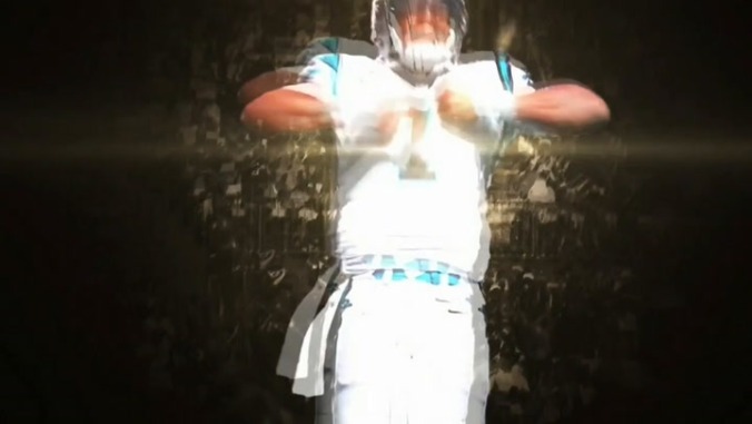
The tone was set early on by a slick pregame “sizzle reel” that served as a stirring prelude to a woman raving over factory-processed poultry. The treatment of the player images and clips is familiar enough and mostly tasteful, although that ripple effect for Cam Newton’s Superman move is unfortunate. The standout here is not the players, in any case, but rather that gorgeous gold (yet not too gold) “NFL WILD CARD” motion logo:
Note how the elements turn gracefully into place, the gentle domino effect creating a sense that everything in the past has led to this moment—exactly how ESPN wants you to feel about its lone playoff airing. The NFL shield rotates more slowly than the letters in “WILD CARD,” so that it settles into place just as that final “D” begins its turn. A touch of clockwork elegance like that goes a long way toward making a game feel special.
 Keep scrolling for more great stories.
