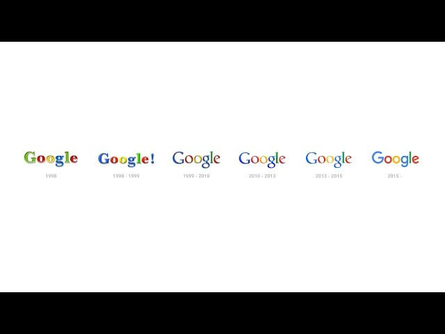
Google unveils new, more huggable logo

In an effort to remind users that it’s the world’s most lovable mega-corporation strip-mining your personal data for advertisers’ use, Google has unveiled a new logo that’s cuter and friendlier than ever. Visitors to google.com today can watch as a cartoon hand puckishly erases the familiar Google logo and draws in a rounder wordmark with colorful chalk—the sort kindergartners would use, because as you know, Google is like a wholesome, innocent child (a wholesome, innocent child who dominates the flow of information on the internet).
For its typeface, the new logo employs a customized version of Circular. It’s a sans-serif beauty that looks cleaner, more modern, and more suited to a leading web company in 2015 than Catull BQ, the prissy serif font used for Google’s previous logo. The circular “G” hints at Google’s all-encompassing purview, and the tilted crossbar of the “e” adds a parting shot of whimsy. That “e” is practically winking at you, saying, “I know you searched for ‘Futurama porn’ last night, but don’t worry, it’s our little secret, and I probably won’t tell anyone!”
An entry on Google’s official blog explains the philosophy behind the new look. According to the post, the company needed a mark that could better capture Google’s diverse range of services and would look presentable on screens small and large. An animation shows how the logo not only folds itself up into a bright, appealing “G” badge but also transforms into feedback animations for activities like voice search. So the next time you say, for instance, “Okay Google, show me some Philip J. Fry ass pics,” you might get to watch some colorful dancing dots while you wait for your results. Thus the unstoppable freight train of innovation surges ever forward.
The company also published a YouTube video that positions the logo as a culmination of Google’s evolution to date. As you’d expect, the video is peppered with soul-deadening Google-isms like, “We need it to understand the world the way you and I do: as objects and relationships between objects.” Whatever you think of the updated logo, surely we can agree that its object-relationship coefficient is superior to the old one, at least in terms of objects vis-a-vis objects. And that’s the key message of this new design: Google loves you and all its objects very much.