Here's how a single font came to dominate movie posters
Even the skinniest of movie fonts carry a lot of weight. The look of a handful of words, maybe advertising a movie called, like, The Fate Of The Furious or Quantum Of Solace or just listing the names of famous directors and actors, can greatly influence how a film is perceived. Naturally, then, movie studios like to identify good, honest, reliable fonts, find proof that they work, and then use them over and over again until everybody’s sick of seeing them.
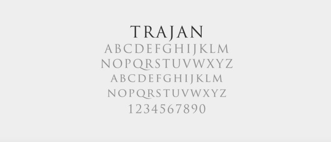
Vox’s “By Design” video series has looked at this phenomenon by zooming in on Trajan, the most popular kid at Hollywood font high school. The clip features an interview with graphic designer Yves Peters, who has been examining roughly 100 movie posters a month since 2006 for his website FontShop. After Peters noticed the rise of Trajan—a font that poster creators seemingly can’t get enough of—he checked into its history, discovering that it originated from designer Carol Twombly who, back in 1989, created the font by “[adapting] inscriptions from Roman emperor Trajan’s column into a digital typeface.”
Since Twombly’s work was packed into early Photoshop software releases, it was soon a common tool for ‘90s designers. In 1992, Trajan was used for At Play In The Fields Of The Lord, The Bodyguard, and Scent Of A Woman. The success of these movies turned the font into the go-to choice for what Peters calls “epic movies—movies about people that overcome difficulties, like big war epics and so on.” Eventually, though, it became “the Arial of movie posters,” showing up absolutely everywhere. Its overuse led to its rejection by bigger studios hoping to advertise new “epics” and adoption by creators looking to quickly add a sense of prestige to their movies.
Peters references the old, pre-digital font days of Hollywood as the precedent for where to look for good modern posters: hand-designed, one-of-a-kind type that provides a personality that canned font work can’t replicate. This is welcome news. In 2018, after all, it’s heartening to hear that original font design is one thing the computers can’t do better than us.
Send Great Job, Internet tips to [email protected]
