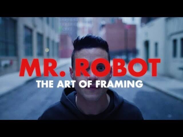
Here’s why the framing always looks so odd on Mr. Robot

While watching an episode of Mr. Robot, you could be forgiven for thinking, “Wait, I just spent that entire shot looking at a park bench behind the characters, rather than the characters themselves.” It wasn’t an accident.
YouTuber Karsten Runquist has been making short explainer videos related to visual storytelling for awhile now, and in his latest, “Mr. Robot: The Art Of Framing,” he takes a stab at describing the reasoning behind the USA series filling up the frame of so many shots with something other than the people we’re ostensibly following. His theory echoes something The A.V. Club has discussed repeatedly in our weekly reviews of the show: Namely, the concept of society functions as a character of sorts, an entity unto itself that the show incorporates into its visual language, often through the societal stand-in of the audience watching the screen. As such, the show makes room for this character in its framing.
This most often occurs via the violation of the rule of thirds. This rule is a Cinematography 101 lesson: Essentially, points of interest—where the director wants your eye to be directed—should occur 1/3 or 2/3 of the way up (or across) the screen, as opposed to being right in the center. As anyone who has seen more than 30 seconds of the show can attest, the rule is broken more or less continuously on the series. Runquist’s explanation isn’t exactly a revelation to anyone who’s been following along, but it’s a nice reminder of how to link the visual aesthetic and the narrative unfolding from season to season.