
What makes a great movie poster?
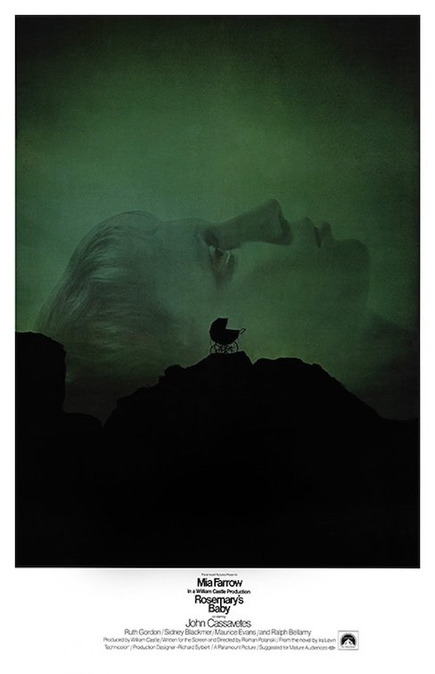
An acclaimed poster designer weighs in on artwork for The Flash, Oppenheimer, and more—and reveals his favorite poster of all time (hint: it's from 1968!)

What does it take to make a great summer movie poster? In the age of mega-franchises and endless IP farming, it’s easy to imagine simply yanking a familiar image of a superhero or action star directly from a movie trailer, pasting it on a rectangular background, and slapping it on a wall. But for the people tasked with making movie posters pop at the multiplex or grab your attention on a social media feed, the art of crafting the perfect blockbuster poster means creating something complex, striking, and original in its own right.
No matter what movie you’re helping to launch, though, when it’s blockbuster season it all starts with the same element. “You just want to build excitement, and I think on all blockbuster hits, that’s the common thread,” Kishan Muthucumaru, Executive Creative Director for Print and Digital campaigns at L.A.-based entertainment agency MOCEAN told The A.V. Club. “You’re dropping a little bit of information, these nuggets leading up to the trailers, the payoff, the poster and the launch date. How do you tease it so that people want to see more?”
As obvious as “build excitement” might sound, how poster designers and artists make that happen can vary wildly depending on the film, the stars, the access offered by the studio, and many other factors. In any given summer, audiences will see dozens of posters for the various films vying for our attention, and they’ll range in style from minimalist character spotlights to massive painted ensemble pieces, and everything in between. Each one has its place, and it all starts with trying to capture a particular tone that evokes the film without telling us the whole story.
Hints of horror and sex for X
Take, for example, Muthucumaru and MOCEAN’s work on Ti West’s indie horror hit X, which included a now-iconic teaser poster that captures the essence of the film’s exploitation throwback roots while telling us almost nothing about the story.
“It’s not a big blockbuster hit, but it definitely needed to have a brand, where you look at it and you’re like, ‘Oh yes, that’s it,’” Muthucumaru said. “So you have the nostalgia of those old horror movies. You want to bring the fun factor of a horror movie into it with the color. You want to have it feel conceptual without giving the whole story away, but have something that suggests something sexual in nature as well, but not show it all.”
In two decades of work as a designer and creative director, Muthucumaru has worked on numerous campaigns, designing artwork for films big and small, like Star Wars: The Rise Of Skywalker at Lucasfilm, The Mother at Netflix and Men at A24. It’s given him a wide range of experiences with films at every budgetary and promotional level, and when you talk to him about his far-reaching career in the design world, it’s clear that no two poster design experiences are alike. What’s also clear, though, is that when it comes to major blockbusters, the process can start very early, often so early that there are no visuals to work from.
“When we started on Star Wars, [we] weren’t allowed to see anything,” Muthucumaru said. “We literally sat down with our client who was kind enough to tell us the story of the movie, and we were given no assets because they didn’t have anything to give us. We created everything from scratch using 3D models. A lot of it is … using anything you can get to come up with these dramatic and beautiful visuals. But sometimes you just don’t have very many assets, or you may never see the film depending on what the film is and what studio it is. Everyone’s different.”