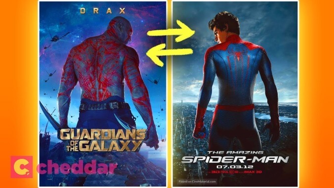
In case you didn't realize all movie posters look exactly the same, here's more proof
Think of the best movie posters from the past few years. Moonlight’s split image of the three Chirons, Rey’s lightsaber dividing the dark side and the light of Kylo and Luke on the The Last Jedi poster, the ethereal glow of Jeon Jong-seo dancing in Burning, and the deliriously raunchy collage of Emma Stone and Rachel Weisz straddling the Queen’s face in The Favourite poster are some of the most memorable and striking one sheets of late. Apart from being exceptionally creative representations of their respective films, those posters also stand out because they don’t follow the typical movie poster formulas. You know what we’re talking about.
It’s no Olivia-Colman-winning-Best-Actress shocker to learn that the majority of posters look pretty much exactly the same, especially for mainstream releases. The folks at Cheddar have recently discovered this phenomenon and decided to investigate why rom-com leads are always leaning back-to-back on posters, or why there are so many freaky close-ups on eyeballs in genre one sheets.
A new video from the YouTube channel breaks down the movie poster tropes you’ve probably noticed before, but never entirely knew the extent of. From similarly positioned actors to the psychological concepts behind contrasting color schemes, it’s all, of course, about tricking you into buying movie tickets. But most importantly, these poster tropes serve one very significant purpose: helping us distinguish the different eras of Matthew McConaughey’s career. There’s pre-McConaughey Poster Lean, and post-McConaughey Poster Lean.
