In storytelling across all media, genre provides a foundation of ideas for artists to build on in their own distinct ways. When working within a genre, creators have character archetypes and plot conventions to stimulate their imaginations, ideally adding specificity to these broad concepts. Killer Groove #1 (Aftershock) has a lot of what you’d expect from a crime comic: the faceless goons, the private investigator, the hired killer, the sullen straight white male lead cracking under the weight of a bleak reality. It’s set in 1970s Los Angeles, a beloved time and place for crime writers, and explores how one act of brutal violence sends a man on a dark path to self-realization.
This is well-trodden territory, and its territory that writer Ollie Masters is comfortable in. Masters broke into the comics industry with another ’70s crime drama, Vertigo Comics’ The Kitchen, an impressive book that didn’t make much of an impact when it debuted, but is getting much more attention now that it’s the source material for a feature film starring Melissa McCarthy, Tiffany Haddish, and Elisabeth Moss. He reunites with The Kitchen’s colorist Jordie Bellaire for Killer Groove, with artist Eoin Marron and letterer Hassan Otsmane-Elhaou rounding out a skilled creative team. [Disclosure: Oliver Sava wrote two past paid contributions to Otsmane-Elhaou’s PanelXPanel comics magazine.] The craft here is what elevates this book above the norm, and the team quickly shows how well it can tell an energetic, atmospheric crime yarn, starting with a burst of action to increase the momentum right away.
Like an infectious opening riff, the cover of Killer Groove makes you stop and take notice. Marron and Triona Farrell’s bleeding guitar image is a striking distillation of the book’s hitman-musician concept, but even more evocative is Charles Pritchett’s production design, which makes each cover a dusty record being pulled out of a sleeve. The credits are prominently displayed in the center of the image rather than across the top and bottom like other Aftershock books, and the physical record creates the impression of a bullseye behind the chunky retro logo, subtly tying music to violence while the main image makes that connection even more explicit.
That relationship between music and violence is one of the most compelling aspects of this first issue, and after the aforementioned act of violence, guitarist Jonny is creatively stimulated. When he tries to replicate the sound in a studio, he freezes up. The studio scene ends on a powerful image of Jonny looking down at the dent left in his guitar case after he used it to bash a man in the skull. The dent symbolizes a disruption in Jonny’s life, interrupting the smooth curve of the case to remind Jonny of what he’s done.
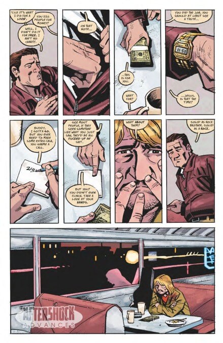
Marron’s thick inks and sharp angles bring out the roughness of Masters’ story, and Bellaire amplifies the mood while keeping the linework at the forefront, occasionally dulling her coloring to the point where it’s almost monochromatic. Otsmane-Elhaou’s lettering matches the course texture of Marron’s linework, and the beige word balloons tie into Bellaire’s ’70s beige and brown palette. This is a creative team that makes smart, bold choices to make this sunny, deadly world come to life, and the result is a crime story that really sings.