Any comic that riffs on well-established characters like Martian Manhunter, Shazam, and Thor inevitably reads as a statement not only on the characters themselves but also the industry writ large, and it’s in this context that Black Hammer and Sherlock Frankenstein both stumble. Lemire is no stranger to superhero stories, but reading Sherlock Frankenstein raises the question: does he even like them all that much? What’s probably intended as a retro take feels increasingly uncomfortable as this final issue progresses and the story careens past outdated. Frankenstein is a cookie-cutter villain, an amalgam of Professor Moriarty, Lex Luthor, and Mister Freeze, who’s motivated to commit crimes because his wife is died. Fridging a woman solely for the emotional growth of a male character is beyond unacceptable at this point, and boring to boot. What’s even more dull is that Frankenstein turns a corner and leaves his life of crime behind when he finds love again with Shazam knock-off Golden Gail, currently trapped it what appears to be an alternate universe over in the main Black Hammer title. It’s a flat, tired interpretation of stories that readers have already seen, but with just enough extra nuance and better representation to make it feel big and important.
Lucy, Black Hammer’s dogged and hopeful daughter, is a bright spot in the whole series, but especially this issue. It’s her absolute certainty that there is a happy ending for them that turns Frankenstein from a misanthropic, bitter old man—albeit one who was no longer crafting nefarious plans to rob and hurt people—into someone who decides to become a hero himself. The world that Lemire has created for Black Hammer often feels too similar to the characters it borrows from to do anything innovative, and Sherlock Frankenstein is the perfect example of that. We’ve already seen plenty of Lex Luthor and Victor Fries redemption arcs, and with only four issues to establish and rehabilitate a brand-new character, Lemire doesn’t have the time to do anything new. But he didn’t have to lean this far into some of the worst habits comics succumb to. The only women in the book are defined by their relationships to the men in starring roles, as Frankenstein’s loves or Black Hammer’s daughter; the reveal that one of Black Hammer’s former villains is a woman is treated as remarkable and her gender is something to comment on, which cheapens that representation. It’s especially unfortunate that Lucy, a young black woman, was forced into the role of being Frankenstein’s conscience and confessor, bullying her father’s enemy into finding hope and forgiving him for his past trespasses a moment later.
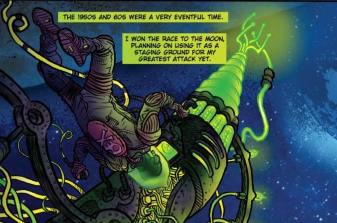
The biggest takeaway from Sherlock Frankenstein is that David Rubin needs to be snatched up for a slew of really great jobs. The double-page spreads and circular layouts in this book are remarkable, and there’s something about the art in Sherlock Frankenstein that evokes both steampunk and dirty dystopian science fiction to great effect. Frankenstein’s expressions are suitably overblown, and Lucy’s anger radiates off the page. The fact that Rubin did lettering, art, and colors alone shows a lot of different skills; vibrant color pop off the page, especially a sickly neon yellow and saturated red, and overall the visuals feel fresh and different and smart. It’s a shame that the story they’re attached to is so stale.

 Keep scrolling for more great stories.
