The 1993 shooter Doom looks like every morally panicked adult’s nightmare vision of video-game violence made manifest. The screen is centered, always, on instruments of violence, its levels are filled with roaring demons, and the soundtrack comprises reprobate-courting MIDI speed metal. Still, the original Doom’s hellish visuals pale in comparison to its painted box art, which depicts a totally ripped space man battling the manically grinning forces of darkness amidst a smoldering landscape of volcanic rocks.
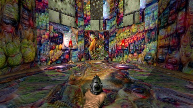
Now, thanks to modern technology, we can see a disorienting glimpse of what Doom would look like if the game’s levels were modeled to more closely resemble its cover.
The clip runs only 15 seconds but took its Tumblr-based creator at “the other blog” just over six hours to render with a number of software modifications, transferring program, and high-end graphics card. They describe the video as having “used a neural network to make Doom gameplay look like the Doom box art,” which follows on their past work to really just fuck the game right up by running “every single [game] texture… through a deep dream [sic] filter.” (DeepDream, in case you’ve managed to forget, is an absolutely wild image-processing program used to make amateur Tool album covers out of anything users can think of.)
While the other results of this experiment are strikingly nightmarish enough on their own, the decision to create a clip specifically guided by Doom’s box art aesthetic has yielded the most impressive results yet. By combining the unknowable intelligence of machine learning and the dark ingenuity of a human brain, the clip’s creator has fully embraced Doom’s techno-hell source material to create results more diabolical than the game’s original makers could have envisioned.
Send Great Job, Internet tips to [email protected]

 Keep scrolling for more great stories.
