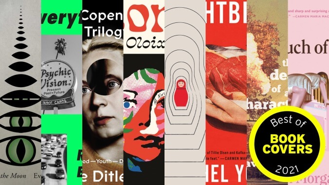
Cover images: New Directions; MCD x FSG; Farrar, Straus & Giroux; Farrar, Straus & Giroux; Open Letter; Doubleday; Stalking Horse; Little, Brown
At its bluntest and most general, the current directive in book design is that covers be, above all else, legible. So that when they’re viewed online (which, for many people buying books, means Amazon), both their text and imagery are immediately eye-catching and recognizable, even when shrunken down to minuscule thumbnails. As a result, a lot of covers end up looking overwhelmingly the same, especially those from bigger publishing houses. This often means an outsized sans serif font, paired with a similarly bold, colorful image.
While some of the covers on this list do fit this general description, they’re instances in which the designers did something interesting within those confines—gently subverting the form, rather than being beholden to it. Other covers ignore the recommendations altogether. Either way, these books, chosen by associate editor Laura Adamczyk and graphic artist Natalie Peeples, are all intriguing or just plain good-looking. Consider putting them on your shelf—face out.
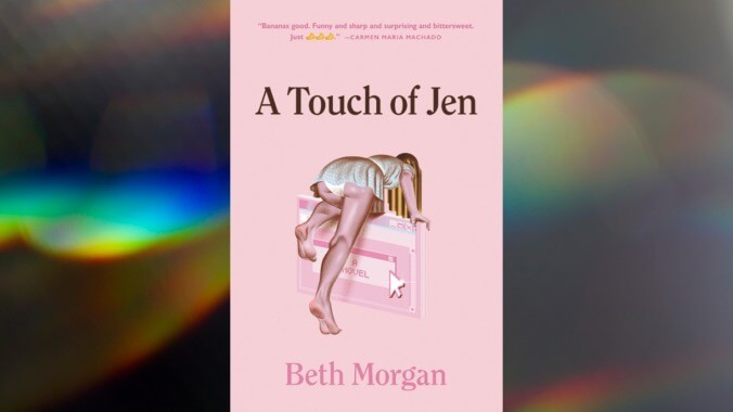
A Touch Of Jen by Beth Morgan
Image: Little, Brown
, designed by Lauren Harms (Little, Brown)There’s more than a touch of the uncanny in the cover for A Touch Of Jen. It’s not just that the young woman seems to be crawling from the physical world and into the internet, a stream of digital lines bleeding down from her head. The sense of something familiar made strange is also echoed in the design itself: That girlish pink, the illustration style, and the font are at once classic yet updated just enough. At first glance, it’s disarming, if lascivious, but it’s clear that something about this world is off.
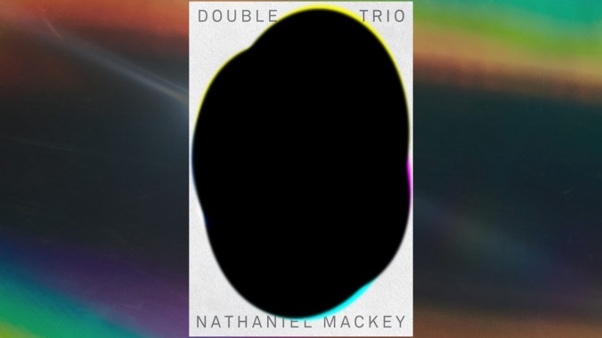
Double Trio by Nathaniel Mackey
Image: New Directions
, designed by Rodrigo Corral (New Directions)As with so many of New Directions’ covers, this one is at once bold and understated, getting the most out of a simple concept through flawless execution. The color offsets, reminiscent of overprinting, are a really nice touch. This is the cover of a three-book set, and the design is broken down and rearranged for each individual volume. Remember this cover when appears on similar lists next year.
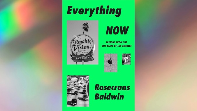
Everything Now: Lessons From The City-State Of Los Angeles by Rosecrans Baldwin
Image: MCD x FSG
, designed by Rodrigo Corral (MCD x FSG)The fuzzy, black-and-white photographs, the sans serif font, the vaguely unintentional arrangement of it all—the cover of Rosecrans Baldwin’s collection of essays about L.A. screams zine, as though you’re about to have it shoved into your hand by someone standing outside Amoeba. It gives the sense of the book having arisen from the ground level of the city. You can almost feel the heat of the sun—or the copier machine.
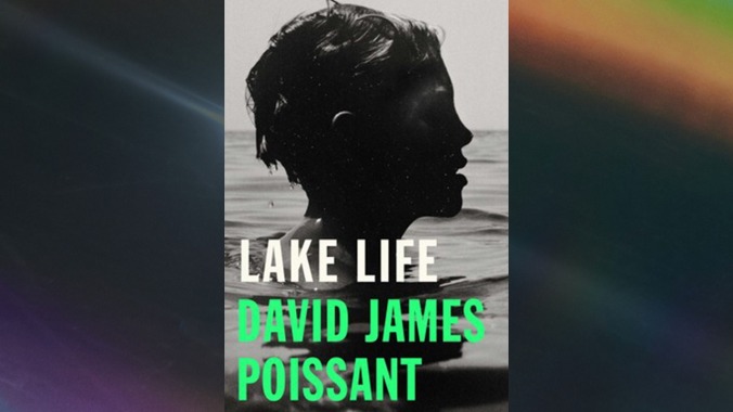
Lake Life by David James Poissant
Image: Simon & Schuster
(Simon & Schuster), designed by Simon & SchusterWhat a photograph. This image of a young boy swimming in a lake, his head just above the water’s surface, evokes the nostalgia and heightened sensory experience of summer (you can almost hear the water dripping off his hair into the lake). At the same time, the high-contrast shadow over his face elicits an ill-defined unease—an apt encapsulation of a novel wherein long-buried secrets are revealed during a family’s stay at its vacation home.
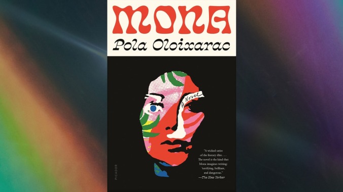
, designed by Thomas Colligan (Farrar, Straus & Giroux)Here, a sexy, psychedelic dream font is paired with an equally striking collage. Designer Thomas Colligan uses the same kind of bold red and green and blue so popular in color-blocked covers, but in a much fresher, intentional way. This one is visceral and feels more than a little dangerous.
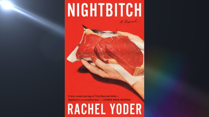
Nightbitch by Rachel Yoder
Image: Doubleday
, designed by Emily Mahon, photograph by Nathan Biehl (Doubleday)While this one certainly satisfies the mandates of contemporary cover design—bright colors paired with easy-to-read, sans serif text; the better to show up in thumbnail images online—it manages to stand out from the overwhelming sameness. (It’s not color-blocking if you only use one color.) The red of it all is rather striking, and the classic advertising imagery, soft and grainy, feels both nostalgic and subversive, especially considering the novel’s premise: A stay-at-home mother/artist becomes convinced she’s turning into a dog. Blink and you’ll miss the butcher paper in the shape of a doberman’s head.
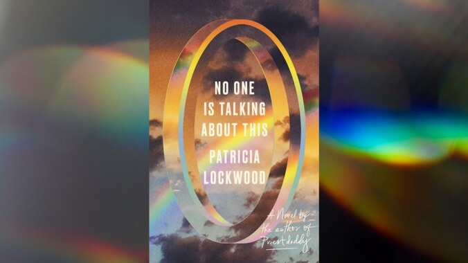
No One Is Talking About This by Patricia Lockwood
Image: Riverhead
, designed by Lauren Peters-Collaer, image by Busa Photography/Getty Images (Riverhead)In her debut novel, Patricia Lockwood refers to the internet as “the portal,” which, for the book’s first half, the protagonist progressively loses herself in. The disorienting optical illusion on the cover of No One Is Talking About This has the appearance of a gateway, but, like Lockwood’s internet, it’s hard to tell if one passes through it to get into or out of something. The cheery rainbow colors are cut through by the darkness of the storm clouds, a hint at the major plot turn that comes midway through the novel. The tacky aesthetics evince the so-bad-it’s-good contradiction at the heart of the best (and worst) of internet culture.
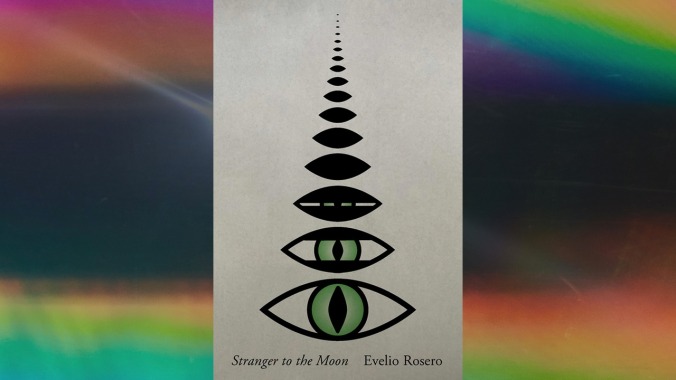
Stranger To The Moon by Evelio Rosero
Image: New Directions
, designed by Janet Hansen (New Directions)Had we ranked this list, this cover would have been at or near the very top. New Directions always has excellent covers, but this one is especially exquisite. On its own, the phases of the moon rendered as an eye opening is wonderfully clever, but it also mirrors the awakening at the heart of this strange parabolic novel. It’s a deceptively simple idea executed perfectly.
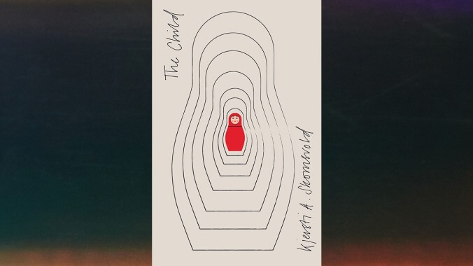
The Child by Kjersti A. Skomsvold
Image: Open Letter
by Kjersti A. Skomsvold (Open Letter), designed by Luke BirdThis isn’t the first great cover for an English translation of the Norwegian writer Kjersti A. Skmosvold’s work; the cover for , published in 2013 by Dalkey Archive, is also a perfect little package. This edition of Skmosvold’s latest novel to be published in English would slide in neatly on a shelf alongside titles from New Directions. It’s also a simple concept impeccably rendered: a matryoshka doll illustrating a story about motherhood and the many layers of ourselves.
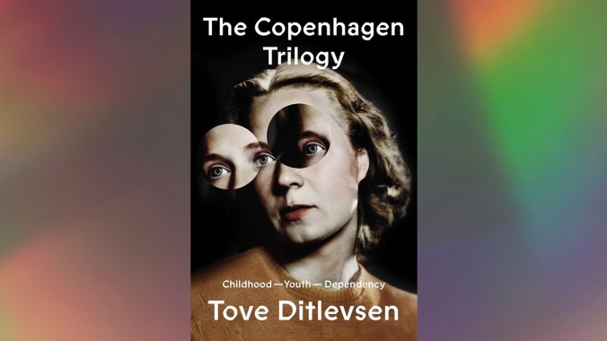
The Copenhagen Trilogy by Tove Ditlevsen
Image: Farrar, Straus & Giroux
, designed by Na Kim, photograph by Rie Nissen (Farrar, Straus & Giroux)Compared with modern digital typefaces, calligraphic fonts—with their alternately thick and thin lines—look more like a human could have written them. This is true with the Prophet font on the cover of FSG’s reprint of The Copenhagen Trilogy, but it’s also mechanical and remixed. It’s familiar and classic but edited. The same could be said for the accompanying image as well: Designer Na Kim deconstructed and rearranged an archival portrait from Danish artist Rie Nissen for this cover of the compiled Copenhagen Trilogy, and for each individual entry: , , and . It’s an aptly disquieting interpretation of Tove Ditlevsen’s harrowing memoirs.
The Death Of A Character by David Ohle
Image: Stalking Horse
, designed by James Reich, image by Rob C. Miller (Stalking Horse)And then there are covers that don’t so precisely complement what’s in the book itself. Designers should do this more often: Make a cool cover, don’t worry how closely it fits. (Seriously.) The Death Of A Character is the latest (and last?) entry in David Ohle’s unofficial sci-fi series that began with the 1972 cult novel . In The Death Of A Character, society is falling apart all around our hero, Moldenke, who’s not in such great shape himself. To say nothing of the human-like helper species that copulates frequently, loudly, and in close proximity to their benefactors. But you wouldn’t have any idea of the very stickiness of this novel from the cover. Were it not for the meteor racing across the sky in this sepia-toned photograph, you might expect this book to be a melancholy coming-of-age story. But this image is a more interesting choice than anything that might more immediately signal the book as science fiction: Life might have once looked like autumn in a sleepy rural community, but that’s all over now.
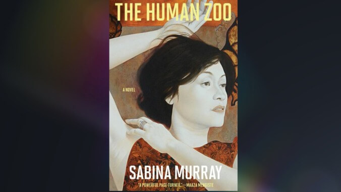
The Human Zoo by Sabina Murray
Image: Grove
, designed by Anamaria Morris, image by Ronald Ventura (Grove)In a design that’s as simple as this—a plain sans serif font paired with a single image—the image has to do a lot of the work, and this one carries the cover and then some. In his gorgeous illustration, contemporary artist Ronald Ventura gestures to an earlier undefined era, mixing modern and traditional styles. Which is fitting for this novel in which a Filipino American journalist researches a story 100 years in the Philippines’ past.
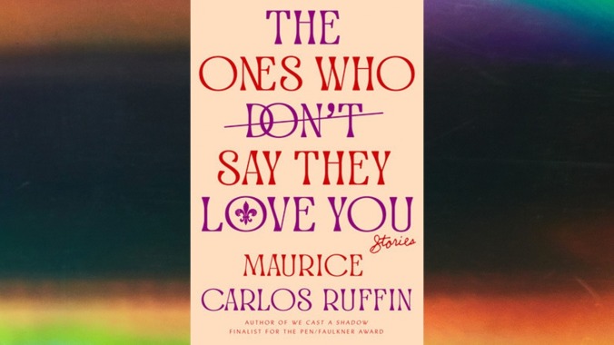
The Ones Who Don’t Say They Love You by Maurice Carlos Ruffin
Image: One World
, designed by Michael Morris (One World)This is the only cover on the list that doesn’t rely on imagery. Sure, there’s that fleur-de-lis inside the “o” in “Love”—a hint at the New Orleans setting for Maurice Carlos Ruffin’s short stories—but that’s it. Instead what is most notable is the cover’s attractive typeface and intriguing layout. With the overlapping of the letters in “ones” and “don’t,” what at first appears straightforward and even staid is very subtly transgressed.
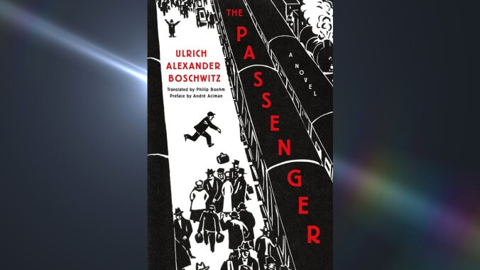
The Passenger by Ulrich Alexander Boschwitz
Image:
, designed by Christopher Sergio, image from The City by Frans Masereel (Metropolitan)The Passenger, originally published in 1938, follows a Jewish businessman as he attempts to flee Germany as the Nazi regime takes control of the country. Otto Silbermann boards train after train in his escape, and that kinetic energy is reflected in the cover of this reprint (and new translation, from Philip Boehm). This image of a bustling train station is one of 100 woodcuts from the 1925 book The City by Frans Masereel, who’s considered one of the progenitors of the graphic novel. The image could have illustrated the book’s original printing, making this a smart, considered pairing.