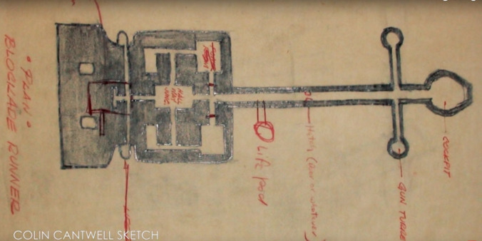
The Millennium Falcon almost looked like a damn sword in the stone
 Keep scrolling for more great stories.

Sure, she may not look like much, but she’s got it where it counts, kid. Besides, as we now know, she could have looked much, much worse.
Serious Star Wars nerds know that one of the biggest pleasures of fandom is geeking out over designs. (Sure, Boba’s Slave I has a sleekness factor, but if you want to get serious, let’s talk a Zonama Sekotan Shuttle from The New Jedi Order series.) And in this new Star Wars-themed episode of YouTube series Generation Tech, host Allen Xie walks readers through a history of the development of the Millennium Falcon, arguably the most iconic ship of the entire universe, Star Destroyers included. As he notes, when the designs first began, it looked like something sitting in the back of a blacksmith’s work area, or possibly what you would need to pry apart to be recognized as the rightwise king born of England.
Luckily, designers soon decided it was starting to look far too much like the ship from 2001: A Space Odyssey, and so they went back to the drawing board. Of course, they then came up with something that resembled yet another well-known spaceship—the Eagle transport from British TV show Space: 1999—necessitating further reworking. As Xie notes, despite burning through a large chunk of the design budget, Lucas eventually found something close to the final design (rumored to be inspired by the director looking at a burger he had just taken a bite out of), and ended up with the famous spaceship that’ll make point five past lightspeed, or so we’ve heard.
[via Laughing Squid]
 Keep scrolling for more great stories.