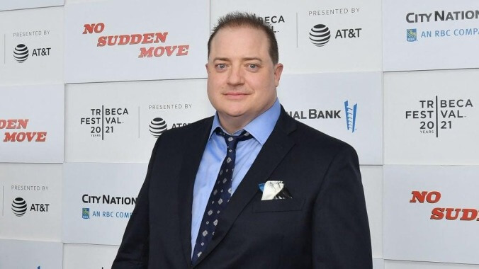
Brendan Fraser, webmaster. Photo: Angela Weiss
Brendan Fraser has returned to prominence after too long away, taking on big enough roles in TV shows and movies directed by Martin Scorsese, Darren Aronofsky, and Steven Soderbergh that fans of the actor have declared a full-on Brenaissance, the likes of which we haven’t seen since Keanu Reeves’ mainstream revival a few years back.
And yet, left behind in all of this is Fraser’s official website, which remains undisturbed as a time capsule of early ’00s design.
BrendanFraser.com is, as pointed out by Boing Boing, “from 2005, and most of its updates happened around 2001.” It now stands silent and stately like an abandoned gift shop in a ghost town.
The filmography section taps out at 2001's The Quiet American, the “announcements” tab shows Fraser taking a selfie with a camera and a Hurricane Katrina fundraiser. And the “about” page is broken into “acts” of his career, ending with a “coming soon” button that promises to detail the Act IV stage of his post-2001 work.
Our favorite bit, though, is a “curiosities” section, which consists of nothing but a handwritten note that opens: “Greeting Netizens!” There’s also a wonderful selection of Fraser-curated bookmarks, where Google shows up “Just because…” and Shockwave is mentioned as the best place to find a “motherload of games, toons, and assorted distractions.”
In short, it’s kind of like the site has been living in a bunker for years while the rest of the world changes around it.
Rather than wipe it from the internet and return with a modern page that properly reflects the design standards of a 2021 website, our advice is that Fraser’s team lean into the nostalgia, updating the site with a cool blog about his daily life and leaving everything else completely unchanged. It works for George R.R. Martin. It can work for Fraser, too.
Send Great Job, Internet tips to [email protected]

 Keep scrolling for more great stories.
