The smiles of the Tennessee Titans offensive starters, reviewed

Block & Tackle is John Teti’s column about pro football.
Smile!
Here are the smiles of the Tennessee Titans offensive (non-quarterback) starters, reviewed.
Taylor Lewan: An ideal rookie smile, friendly but humble. Look for Lewan to break out the full grin once he’s had a few years to develop in the league. B+
Andy Levitre: A confused, uncertain smile. Levitre is happy, but he’s also afraid something bad is about to happen. “Uh, so, what are you going to use this picture for, guys?” “Quiet, Andy.” B-
Brian Schwenke: A melting smile. Like a small coffee shop situated next to a new mega-mall, the lips are just trying their damnedest not to be consumed by the ever-encroaching expansion of Schwenke’s neck-chin complex. C-
Chance Warmack: A great smile, but why is Warmack so blue? It looks like he’s smiling at us from a page in a Myst linking book. A-
Michael Oher: Is sad. F
Nate Washington: A smile of quiet confidence. Respectful, unassuming, and bland, this smile is the facial-gesture equivalent of handing the football to the referee after a touchdown. And then drinking an orange Gatorade and driving home in a Toyota Corolla. B+
Justin Hunter: An eager-to-please smile. Your grandmother loves this smile. “Look at that Justin Wrhunter, now there’s a nice young man!” B
Kendall Wright: A sexy smile. Only a wide receiver could pull this off. A
Bishop Sankey: A sort of creepy smile, but the smile isn’t really the point here. Eyebrows: A
Shonn Greene: Was happy, but then Michael Oher made him sad. F
Chase Coffman: A semi-stoned smile. Coffman got a start in place of Delanie Walker, who was out with an injured smile. C
The experience of being a Chicago Bears fan in 2014
“Hooray, it’s time to clap! Oh… I see.”
Eight seconds of Aaron Rodgers looking at stuff and doing funny things with his mouth
Doink of the week
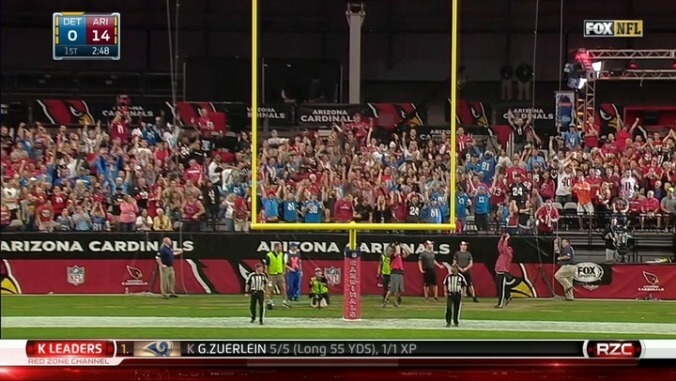
Excellent timbre on this one. A doinked field goal is so spectacular, it ought to be worth four points! And in fact it’s worth three, which is pretty close. Good job, NFL.
(Thanks to Twitter correspondent Zone Read for the assist.)
Corrections to the corrections department
In the corrections section of last Friday’s Block & Tackle, I passed along a note from a commenter who observed that the primary typeface in NBC’s Sunday Night Football graphics is the popular DIN 1451. On Twitter, B&T reader Raymie Humbert claimed that our commenter was wrong, and we were actually viewing the clean, graceful lines of a font called Frank:
I took a closer look for myself to settle this controversy, and Raymie appears to be correct. The most obvious evidence lies in the ampersand. NBC’s graphics use an ampersand with an open bowl at the top, as seen here in a cropped, arrow-enhanced screenshot from this week’s Sunday Night broadcast:
Let’s compare. The DIN 1451 ampersand looks like this:
Uh-oh! That’s not right. Now observe the Frank ampersand:
That looks familiar. When in doubt, look to the ampersand. The ampersand will show you the way.
There are other details that shore up the case for Frank, too. For instance, when we first started talking about the Sunday Night graphics last Tuesday, I posted this shot of a Jay Cutler/Aaron Rodgers comparison chart:
If I try to recreate the “AARON RODGERS” text in DIN 1451, I get this:
The tell here is the “R,” which has a narrower bowl in DIN than it does on NBC. Also, I couldn’t find other weights of DIN 1451 to match the subtle mix of medium-weight and bold lettering that Sunday Night Football uses for athlete names in these graphics, which is another strike against the DIN theory. Meanwhile, with Frank I can render the shifty-eyed star Packers quarterback like so:
Which looks exactly right. So the verdict is that Sunday Night Football uses Frank. (It’s a slightly customized version of Frank—for instance, NBC’s number “1” differs from the “1” in the version of Frank that’s available to the public.) Don’t blame our first correspondent for getting this one wrong, though. It’s a close call. An overlay of the two fonts shows that Frank was clearly inspired, directly or indirectly, by its German forebear:
Thanks for the heads-up, Raymie! And now we are done talking about fonts. For today.