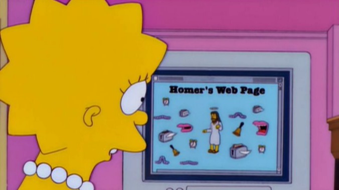
In this era of reboots, you can’t blame a site for trying to keep things fresh: Today we launch our redesigned homepage, which we hope you’ll like way more than Baby Nut. “I hate change!” you may protest. We get it. But we swear this shiny new homepage provides you all the A.V. Club stories you want, just more of it and faster than ever.
Sound too good to be true? We promise it’s not. We first commissioned a redesign from the engineer who got Slack to work on a Super Nintendo, but they didn’t return our calls. Then we remembered we had our own team of crackerjack design and web experts and tasked them with creating a homepage that would contain more stories in a single frame, consist of fewer ads, and load faster than our previous design. And they did not disappoint.
Let’s take a gander at the new features, shall we? Don’t worry, most things—including the comments section—remain the same.
We know you like going to the movies, so we’re making sure your favorite features and big stories will get the widescreen treatment right at the top of the page. (And as a little gift to celebrate the new homepage launch, we’re giving you Caroline Siede’s bi-weekly column, When Romance Met Comedy, a day early.) This marquee feature space will emerge at the top of the homepage throughout the week when we’ve got something particularly special to share.
Below that, you’ll find a module that looks a lot like our retired homepage layout. But if you look closer, you’ll see we’ve squeezed more stories into the frame, and we’ll be updating this section more frequently, curating the best of the site for busy readers like you.
But wait, there’s more! Our movies, TV, music, books (under “AUX”), and other landing pages are still accessible from the top navigation bar, but we wanted to highlight some of those pages’ great features right on our homepage. You’ll find a good variety of our content as you scroll through, and we’ll be popping in special sections to round up our coverage of big pop culture moments throughout the year. Definitely expect a Bond section soon…
We know many of you avid A.V. Club readers visit the homepage multiple times a day looking for the latest stories we posted while you were in that meeting about having too many meetings. The old homepage put our latest stories right at the top, which was great. But that meant other fantastic features disappeared into the cold ether of the dark web, or wherever pop culture criticism goes to die a quiet death until someone randomly googles, “Can I buy a Deal Or No Deal case?” That wasn’t so great. So now you can find our latest stories, organized by most recent, by clicking “Latest” in the navigation bar. (That link previously took you to our homepage; for that you can just click the A.V. Club logo.)
We will keep tinkering to give you a better experience, but we are the same A.V. Club you have known (and hopefully loved) for eons. And, as always, we want to hear from you: What’s working? What’s not? Should the need arise, we’ll update this story below with any new-homepage FAQs to ease you through this transition. To also help with that, here’s a video of a teacup puppy that’s too fluffy for its own damn good.

 Keep scrolling for more great stories.
