What’s your favorite album artwork?

Join the discussion...

This week’s AVQ&A comes from associate editor Laura Adamczyk:
What’s your favorite album artwork?
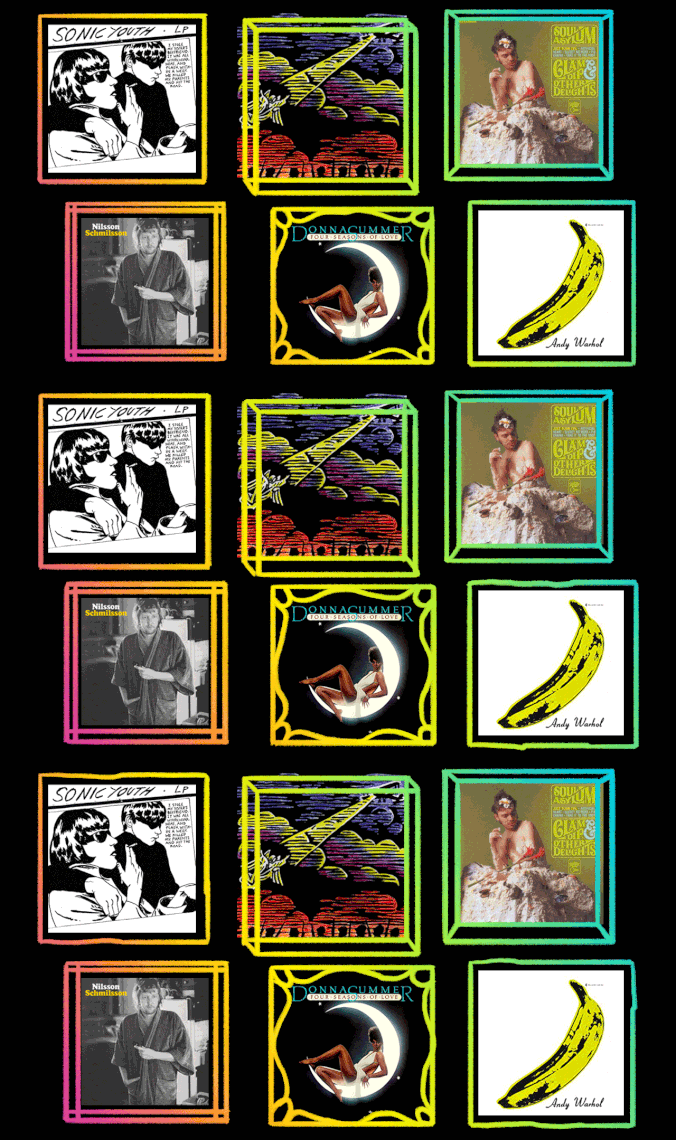
Whenever I close my eyes, I see Donna Summer perched suggestively atop a glowing crescent moon. In a decades-long career, no image better encapsulates the effortless glamour and sexuality of the “Queen Of Disco” than the cover of her fourth studio album, 1976’s Four Seasons Of Love. The four-song concept LP—which traces the rise and fall of a love affair across the seasons—included a stunning portrait of the diva themed to each track, but the art for “Summer Fever” became the album’s cover star (it is her namesake season, after all). Straightforward, yet suggestive, the artwork is emblazoned in my mind as a shimmering emblem of the disco genre.
Andy Warhol didn’t need to sign the cover of The Velvet Underground & Nico. The intersection of erotica and consumer advertising, the cheeky instructional text, the shades of yellow and pink (the latter revealed by following the instructions) not occurring in nature—all say “Andy Warhol” without saying “Andy Warhol.” And while the only name on the cover might confuse the matter of who’s responsible for The Velvet Underground & Nico’s musical contents, that all clears up once you hit play. After that, the banana becomes a manifestation of Warhol’s pop-art dream, an endlessly replicable masterpiece that anyone can own, suitable for framing or printing on a T-shirt. It’s an indelible image as timeless and beguiling as the songs still waiting, after all these years, for you to peel slowly and see.
The visual component of a Gorillaz album is just as crucial as the music, and for me it’s never been expressed as well as it was on Demon Days. Every other Gorillaz cover feels like a piece of art, meaning something an artist designed, but the simplicity of Demon Days lets 2-D, Murdoc, Noodle, and Russel stand on their own—as if it features actual photos of real band members and not cartoon characters. Also, the Let It Be reference in the layout is a nicely playful bit of pompousness that I think is a good gag on its own.
I like it when an album cover feels like a work of art: something that is both somehow representative of the music contained within, yet also an image that could stand on its own inside a frame on a wall somewhere. And while I don’t know if it’s the best album cover I’ve ever seen, the one I’ve probably enjoyed the most is the stark black-and-white iconography on the cover of Sonic Youth’s Goo. Artist Raymond Pettibon, whose talents were birthed in the SoCal punk rock scene—designing posters and album art for bands on SST, the label founded by his older brother (and Black Flag member) Greg Ginn—remains an enigmatic fascination for me, all these years later. The illustration of two young mods, based on a photo of two witnesses from Britain’s notorious , conveys the tenor of the band’s cool-experimental sound, but also? It’s just an awesome piece of art.
Sure, the title of Explosions In The Sky’s Those Who Tell The Truth Shall Die, Those Who Tell The Truth Shall Live Forever sounds like something a sad-eyed freshman might scrawl on a toilet stall, but at least two things about the Texas outfit’s sophomore effort hold up: the music and the artwork. Cast in earthy shades of red, purple, and yellow, the cover is said to reference the Angel Of Mons, a story about an army of angels that protected an overwhelmed British Army during the Battle Of Mons in Belgium at the beginning of World War I. It’s a famously outsized rumor that was more or less born of fiction, but the image of luminous, arrow-shooting angels bursting through the rusty haze of a battlefield remains objectively lovely, not to mention a properly grand illustration of the band’s cinematic symphonies of guitar and drums.
I’m going to out myself as being just unimaginably basic here, but I don’t know that any album cover has ever fascinated me more than the gaudy scavenger hunt that is The Beatles’ Sgt. Pepper’s Lonely Hearts Club Band. As a kid, I would pore over the grab bag of wax figures and old photo cut-outs on my parents’ copy of the CD (and the accompanying map!), trying to figure out who the hell any of these people were—at least, the ones who weren’t Shirley Temple or Marilyn Monroe. Any album cover that makes a 6-year-old ask their parents who Aleister Crowley or Lenny Bruce is gets top marks from me, basic or not.
There’s only one album cover I’ve ever seriously considered getting tattooed on my body, and that’s the art on Neko Case’s Fox Confessor Brings The Flood. Everything about this 2006 record speaks to me—the music, the lyrics, and Julie Morstad’s art, which perfectly captures the music’s witchy, Shirley Jackson-esque folk-noir atmosphere. (Both Case and Morstad were at the time they worked together, a fun bit of creative kismet.) The cover shows a woman with short brunette hair in a ’20s-style dress presenting the decapitated head of a redhead to a gathering of foxes; the brunette’s shiny bob and the foxes’ thick orange fur contrast with the delicately sketched back-and-white lines of the rest of the drawing, textural details distracting enough that you might not notice at first that our snowbound Judith also has the legs of a deer. I never went through with the tattoo, but if I had, I wouldn’t have regretted it.
I like many kinds of album cover art: ; of , ; ornate 2000s-era illustrations à la or . It’s too hard to decide, so I find myself falling back on an old classic: dudes who can’t be bothered. Perhaps the best example of this is the cover for Harry Nilsson’s pseudo-eponymous 1971 album, Nilsson Schmilsson. The cover photograph—in which the singer-songwriter wears a robe, is unshaven, kind of needs a haircut, looks mildly dazed, isn’t looking in the camera—is not even in focus. It’s a lovely, low-key flex to put a photograph of yourself on the cover of an album that would become one of the best of the decade looking like you just rolled out of bed. The opening song may say you’ve “gotta get up,” but the cover suggests otherwise.
When Soul Asylum finally left local Minneapolis label Twin/Tone for the lofty major-label climes of A&M, they said goodbye to its longtime home in appropriately hilarious fashion. The band released the 1989 EP Clam Dip & Other Delights on the label—a twisted homage to the classic album Whipped Cream & Other Delights by Herb Alpert, the “A” in A&M. Instead of a young beauty surrounded by fluffy white cream, Soul Asylum doused bassist Karl Mueller in what appeared to be clam dip (reportedly, a mix of sour cream, paint, whipped cream, and seafood, with a few clamshells thrown in) for an unforgettable take on that classic album cover, even supplanting the A&M logo with a Twin/Tone version. The EP was pretty great on its own, with spirited, unbridled rock tracks like “Just Plain Evil” and “Take It To The Root,” and a cover of Minneapolis band The Wad’s “Chains,” but most people can’t forget Clam Dip’s unusual album cover—even if they wanted to.
GET A.V.CLUB RIGHT IN YOUR INBOX
Pop culture obsessives writing for the pop culture obsessed.