Wrap your eyes around the "visual language" of the Spider-Verse

Last year, just when everyone thought they had reached their fill of feature-length Spider-Man adaptations, Spider-Man: Into The Spider-Verse swung onto the scene and blew everybody away. With engaging characters, whip-smart writing, and vibrant, energetic animation, Into The Spider-Verse had something for kids, adults, comic book fans, and Marvel newbies alike. Now, in a new behind-the-scenes feature from WIRED, we’re getting a look at how such an immersive, animated universe came to be.
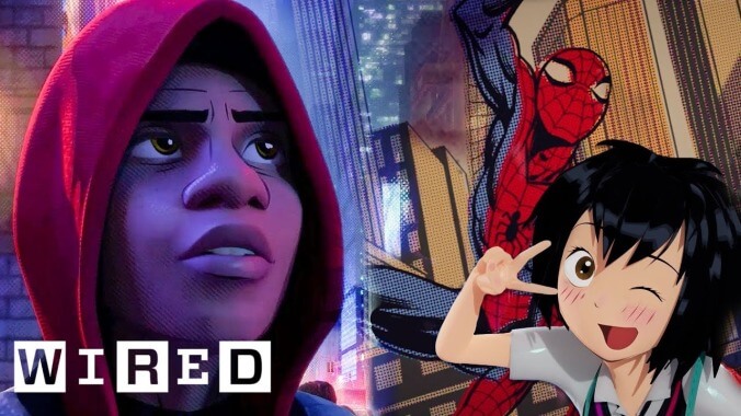
According to visual effects supervisor Danny Dimian and character animation supervisor Joshua Beveridge, their guiding principle when creating the Spider-Verse was to stick as close as possible to the source material. Rather than implementing frequently-used animation techniques like motion blur and camera focus, they opted for a more illustrated style, allowing each frame to function as a page of a feature-length comic book. This crisp, clean aesthetic was only enhanced by the animators’ use of Kirby Dots or Kirby Krackle, a stylistic device created by comic book artist Jack Kirby in which fractal-like dots are used to represent negative space or energy waves.
Continuing to mirror the look and feel of comic book panels, the Spider-Verse animators favored minimalism when filling in the details of their New York City setting. Rather than tirelessly populating the background of every frame with fully-rendered people, cars, and office buildings, they relied on stylistic color blobs to signify motion and light. This foundational style allowed the animators to then bring in an eclectic group of characters, each sporting their own aesthetic, while still maintaining a cohesive feel. Long story short, that Best Animated Feature Oscar is well-earned.
Send Great Job, Internet tips to [email protected]