You’ve never seen a coming-of-age story like A Map To The Sun

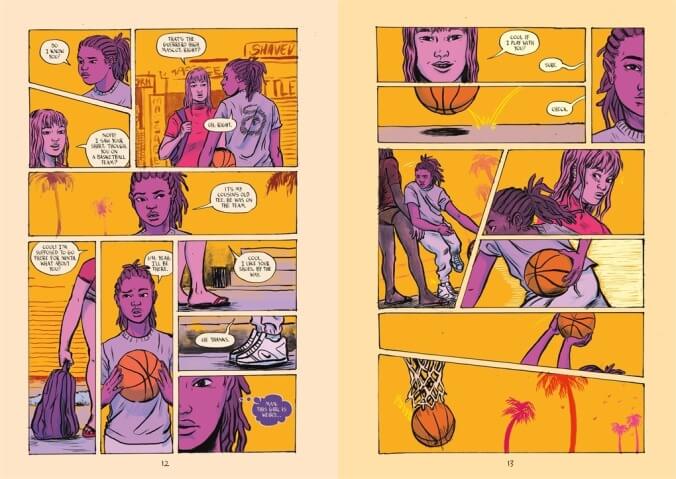
For too long, naturalistic coloring or the absence of color have been the norm for comics targeted to mainstream audiences. The crossover stars of the early graphic novel boom—Art Spiegelman, Daniel Clowes, Adrian Tomine, Alison Bechdel—put out work that was either black and white or had a minimalist color palette, equating seriousness and respectability with toned-down visuals. Sloane Leong’s outstanding A Map To The Sun (First Second) refuses to play this game, using a Lisa-Frank-meets-blacklight-poster color palette to tell a grounded story of five girls starting a high school basketball team. The juxtaposition of offbeat, surreal coloring with frank, deeply relatable writing supercharges the story with energy and emotion, showing the immense creative potential of breaking from reality to embrace the full color spectrum.
After the mind-blowing sci-fi psychedelia of Prism Stalker, Leong moves in a very different narrative direction with A Map To The Sun, exploring the challenges of being a young woman in an everyday environment. The team’s captain, Ren, struggles with abandonment issues stemming from her mentally unstable older sister leaving home at a young age, and she enters an especially volatile time when both her sister and former best friend Luna come back into her life. Other team members deal with insecurities about their appearance, the perils of online dating, and manipulation by older men—topics that Leong explores with honesty about the messiness of adolescence. A key part of growing up is realizing that life’s problems don’t come with concrete solutions, and by the end of A Map To The Sun, these young women are still dealing with issues that will stick with them for much, if not all, of their lives.
Leong has a great ear for teen dialogue, but her specialty is creating a mood that puts the reader inside the characters’ heads. The story begins with quiet moments of Ren playing basketball and Luna surfing, scenes of solo bliss that merge in a way that builds a bond between the two girls before they ever meet. In a masterful transition, Leong shifts from a basketball on a hoop to a surfer in the ocean, the basketball’s falling action replaced by the swoop of Luna and her board. Leong’s deep understanding of color, texture, and motion makes this tiny moment feel massive, creating an expressive visual transition that can only be achieved in the comics medium by blending static images with tightly controlled sequential movement.
Color is Leong’s most powerful tool, and she establishes bold color themes throughout the book that amplify the feeling on the page. Intensely saturated, clashing colors create tension and discomfort, while more delicate color combinations put the reader at ease and bring out the softer sides of these characters. Aditya Bidikar’s lettering matches the organic quality of Leong’s linework, adjusting the colors of word balloons to fit the governing palette of each scene.
There’s the coloring inside each panel, but also the coloring of each individual page, with Leong using one dominant shade to set a fixed point of contrast that informs that specific moment. It makes the physical book of A Map To The Sun a wonder to behold, the colored pages creating a polychromatic side-view both visually enticing and indicative of the stylistic choices distinguishing it from other YA stories. You don’t have to open this book to know that it’s something different and special, and the story within brings emotional richness and depth to a striking visual aesthetic.
