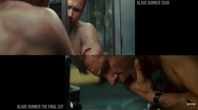
Now that Blade Runner 2049 is safely on video, it can be properly obsessed over by cult-like fans who bemoan the unwillingness of mainstream audiences to sit through a three-hour sci-fi tone poem. YouTube video essayist Thomas Flight has put together a tight four-minute analysis pitting shots from Denis Villeneuve’s new film against Ridley Scott’s 1982 original, and, while the images speak for themselves, the video draws some interesting conclusions about the ways Villeneuve and cinematographer Roger Deakins embraced the film’s predecessor without slavishly winking at the audience, as must’ve been tempting. Instead of, say, building a plot that chases the ghost of the original as other nerd-culture franchises have, they acknowledge its long, neon shadow with establishing shots that place both narratives within the same setting, albeit at different times. Sure, there are visual signifiers carried over pretty directly, like the massive outdoor advertisements or the fetishized Asian iconography, but they’re also done much more broadly, like via abandoned art deco architecture or eerie aqueous lighting.
It’s a nice reminder of the movie’s titanic visual accomplishment, at least for people predisposed to continue obsessing over this for as long as humanly possible. The movie’s also really well written, too, but we’ll save that for another YouTube video essay.