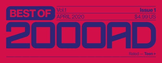
Over the past decade, Tom Muller has emerged as the most exciting designer in comics, giving books their own distinct aesthetics that enrich the stories and make the product pop on stands. Muller recently helped Jonathan Hickman give Marvel’s X-Men line a drastic makeover, and in April, he’s tackling one of the most iconic brands in comics by designing the logo for April’s Best Of 2000AD series. The expansive world of 2000AD can be daunting for new readers, and Best Of 2000AD provides an accessible entrypoint to a library of comics that goes beyond the publisher’s signature character, Judge Dredd.
Once in the UK, Muller started to track down the 2000AD stories that he missed out on in Belgium, leading him to some of the most striking design sensibilities in comics. “That’s how I really discovered the work Steven Cook and Rian Hughes on the publications and how they showed that design and branding done well in comics can have such a positive impact on the end product. That has always been a benchmark for me in that sense.”
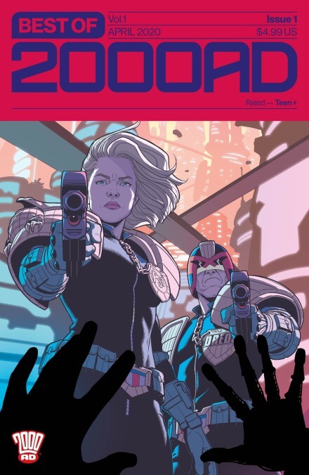
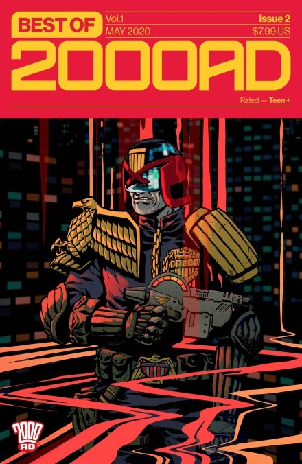
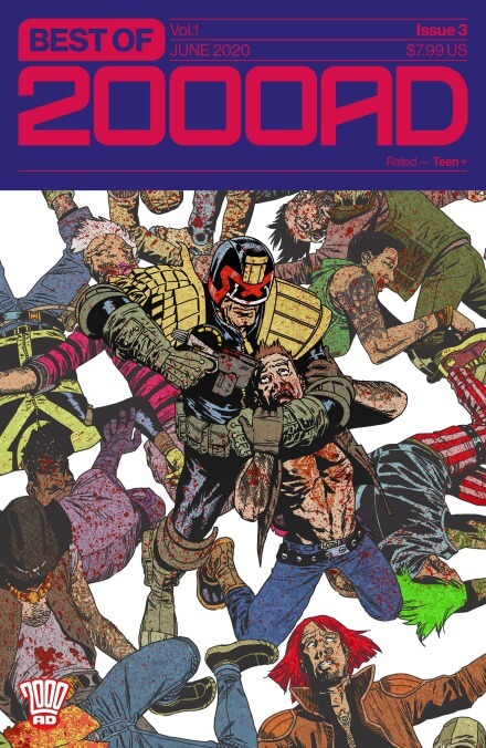
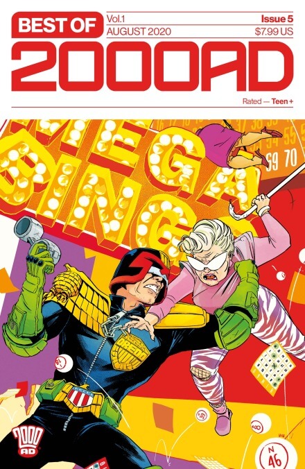
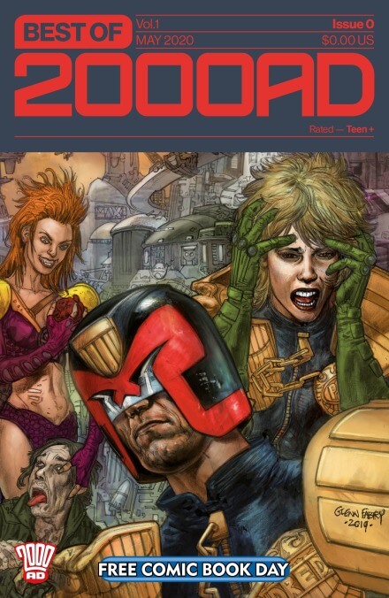
The A.V. Club has an exclusive peek at Muller’s process art for the Best Of 2000AD logo, exploring different typefaces, color combinations, and layouts. We also have a look at the covers for the series’ first five issues and Free Comic Book Day special, featuring the work of artists Jamie McKelvie, Becky Cloonan, Charlie Adlard, Erica Henderson, Annie Wu, and Glenn Fabry.
“The thing that has always imbued the 2000AD look is that it feels a bit dangerous, and something that, as a kid, you shouldn’t be reading,” says Muller. “It has certainly always felt more mature and daring than their US counterparts. Especially during that period when the magazine was designed by Steven and Rian it felt to me like a pop culture magazine, something akin to NME (New Musical Express—a seminal UK music weekly) or The Face in its heyday.”
“In comics I’m always looking at something that doesn’t look like a ‘comic book logo’,” says Muller. “People that read comics don’t live in a vacuum. They will also consume other media, read other magazines, and are exposed to a lot of other, contemporary, design. That’s what I’m always aiming for: a contemporary and relevant design. Looking at the bigger picture, a good logo is something that a brand can hang their identity on: a symbol that becomes synonymous with who and what you are.”
“We definitely wanted to create something that is modern and fresh that builds on the heritage of the brand,” says Muller. “In part the final design is a distillation of the best elements of the 2000AD branding over the decades; but it’s also a contemporary take on what a masthead and cover can look like in today’s market. Something that retains the iconic character of the name; in a design that is immediately noticeable on the shelves.” Reader can discover the rich history of 2000AD by picking up Best Of 2000AD #1 on April 29, and retailers have until January 23 to place their orders.